
- The core problem is hidden: ATS bots can reject a strong resume if formatting blocks parsing, and recruiters still rely on a 6 to 7 second visual scan.
- ATS basics explained: It scans, parses, categorizes, then ranks you by keyword match, so anything it cannot read becomes missing data, and missing data becomes rejection.
- Ten formatting mistakes that kill results: Creative fonts, multiple font styles, header or footer contact info, columns, tables, graphics, unclear date formats, non-standard headings, acronyms without spelling them out, wrong file type or sloppy file name, and inconsistent formatting.
- Fix and finalize with guardrails: Single-column layout, standard headings, consistent Month YYYY dates, text-based PDF, professional file name, and clean spacing that supports both ATS and human scanning.
- Test before submitting: Do the copy-paste into Notepad check, use an online ATS scanner, export to .txt to see raw order, then run the 5-minute checklist to catch issues fast.
Understanding the Gatekeepers: ATS Bots and the 6-Second Scan
Introduction: The Unseen Error That Leads to Rejection
You spent hours, maybe even days, crafting the perfect resume. You listed every achievement, polished every bullet point until it shined, and even had your most detail-oriented friend proofread it. You hit “submit” with a feeling of confidence, then… silence. Days turn into weeks. You hear nothing back. Here’s the brutal, frustrating truth: it might not be your experience that’s the problem. It’s not your qualifications. It’s how your resume looks. When resume formatting mistakes confuse the Applicant Tracking System (ATS), your application is auto-rejected and never makes it to a human recruiter – no matter how qualified you are.
According to industry research, over 75% of all resumes are rejected by ATS software before a human recruiter ever lays eyes on them. Think about that. Three out of every four applications are filtered into a digital void, not because the candidate was wrong for the job, but because a robot couldn’t read their resume. The culprit, almost every time, is a series of small, avoidable formatting issues that make your resume impossible to parse correctly.
This guide isn’t just a list of “don’t do this.” It’s a deep dive into why these mistakes happen, how they break the technology, and how they violate the unwritten psychological rules of the “6-second scan” that recruiters use. The good news is that these mistakes are entirely avoidable once you know what to look for.
What Is ATS and Why Does Formatting Matter So Much?
An Applicant Tracking System (ATS) is software that nearly every medium and large company uses to manage the hiring process. Think of it as a gatekeeper, or a digital bouncer for job applications. Its job is to filter and organize the hundreds (or thousands) of resumes they receive for every single job posting.
The ATS’s process is simple and ruthless:
- Scan & Parse: It “reads” your resume file and tries to extract key pieces of information, like your name, contact info, work experience, job titles, dates, and skills.
- Categorize: It attempts to slot this information into a standardized digital profile for you.
- Filter & Rank: It then compares your profile against the keywords and qualifications listed in the job description.
- Score: It gives you a “match score.” If your score is below a certain threshold (say, 70%), your resume is automatically archived. A human never sees it.
Here is the critical problem: ATS systems are not intelligent. They are not human. They are literal-minded parsers that get confused by anything they weren’t programmed to expect. When your resume includes complex graphics, fancy fonts, columns, or information hidden in headers, the system fails to parse your data correctly. This can result in your skills being missed, your experience being jumbled, or your entire resume being flagged as an unreadable, incomplete error.
The formatting mistakes we’ll cover below aren’t just minor aesthetic issues – they are technical barriers that prevent your qualifications from being properly evaluated.
The Human Factor: The 6-Second Scan
Even if you get past the ATS, your resume has one more boss to defeat: the human recruiter. And they are even more ruthless. On average, a recruiter spends 6 to 7 seconds on their initial scan of a resume.
In those 6 seconds, they are not reading. They are pattern-matching. They are looking for specific things in specific places:
- Job Titles
- Company Names
- Start and End Dates
- Keywords related to the job
Formatting mistakes that break visual hierarchy – like inconsistent fonts, bad margins, or a lack of white space – make this 6-second scan impossible. If a recruiter has to hunt for your job title or can’t immediately tell how long you worked somewhere, they’re not going to try. They’re just going to move on to the next resume in the stack of 200.
Therefore, your formatting has two jobs:
- Be simple enough for the ATS robot to parse.
- Be clear enough for the human recruiter to scan in 6 seconds.
The mistakes below fail one or both of these tests.
10 Critical Resume Formatting Mistakes to Avoid
Mistake 1: Using Creative Fonts, Multiple Font Types, or Bad Sizing
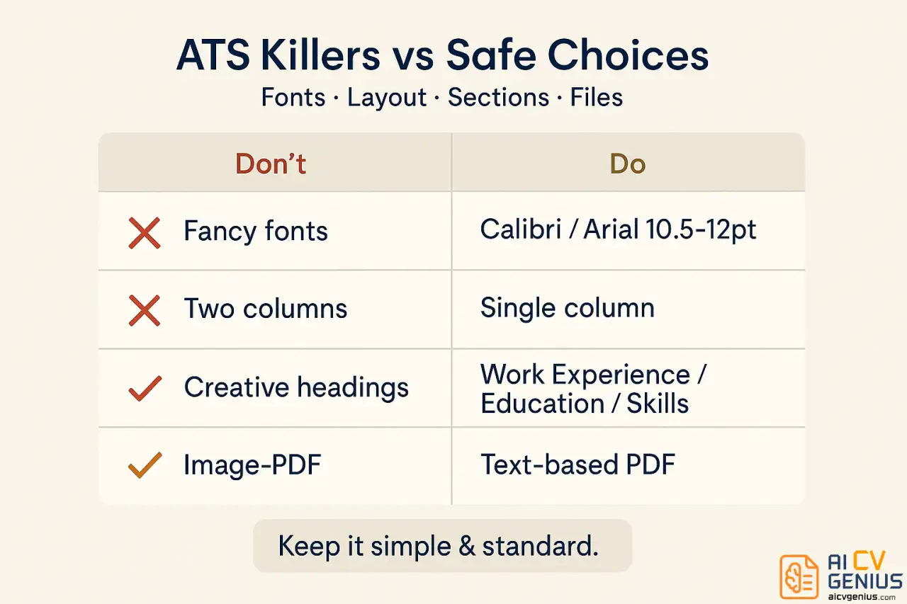
That fancy script font (like Papyrus or Brush Script) might look elegant to you, but it’s digital death to your resume. ATS systems are trained to read standard, professional fonts with clear character definition. When you use decorative, uncommon, or overly “thin” fonts, the system’s Optical Character Recognition (OCR) often fails. It can’t parse the text correctly, turning your carefully written experience section into a string of gibberish and errors.
For the human recruiter, it’s even worse. It screams “unprofessional” and “hard to read.” Anything that causes the recruiter to squint or pause is a point against you.
The Fix:
- ✅ Stick to ATS-friendly fonts: These are your “safe” choices.
- Sans-serif (Modern): Calibri (the Microsoft default, very readable), Arial, Helvetica, Verdana
- Serif (Traditional): Times New Roman, Georgia, Cambria
- ✅ Keep font size legible: 10.5 to 12 points for all body text. Going smaller (like 9pt) to fit it all on one page is a critical error. It makes it unreadable for the human.
- ✅ Use hierarchy for headers: Use 14 to 16 points (and bold) for your section headers (“Work Experience,” “Education”) and 18 to 22 points for your name at the top. This creates a clear visual path for the 6-second scan.
- ✅ Never use more than two fonts in your entire resume (one for headers, one for body text is the absolute maximum, but using one font family – like Calibri for body and Calibri Bold for headers – is even better).
Example of the problem:
Wrong:
Using Brush Script MT for your name and Comic Sans for your experience section creates parsing errors, looks incredibly unprofessional, and will likely get your resume thrown out before it’s even read.
Right:
Using Calibri Bold 16pt for your section headers and Calibri 11pt for all body text creates clean, readable formatting that both ATS and humans can scan effortlessly.
Mistake 2: Placing Critical Information in Headers or Footers
This is one of the most common and devastating resume formatting mistakes. Many job seekers, especially those using pre-built templates in Microsoft Word, place their name and contact details in the document’s header for aesthetic reasons. It looks clean and saves space.
Unfortunately, most ATS systems are programmed to ignore headers and footers entirely. They only read the main body of the document.
What happens when you put your contact info in the header? The ATS successfully parses your resume, loves your experience, and gives you a 95% match score. The recruiter sees your profile and wants to call you for an interview. But the system couldn’t find your phone number or email address because they were in the header. Your entire application file is now effectively anonymous. It’s marked as “incomplete” or “missing contact info,” and the recruiter is forced to move on. You were the perfect candidate, and you were rejected because the robot couldn’t find your phone number.
The Fix:
- ✅ Place ALL contact information in the main body at the very top of your resume. Start on the first line.
- ✅ Include: Full name (make this the largest text), Phone Number, Professional Email Address, LinkedIn URL (hyperlinked), and City/State (or City/Country).
- ✅ Skip the full street address. It’s an outdated practice, a privacy risk, and clutters the top of the page. City and State are all that’s needed.
- ❌ Never use headers or footers for any critical information. This includes your name, email, phone number, or page numbers (if you have a two-page resume, just let it flow naturally).
Mistake 3: Using Tables, Columns, or Graphics
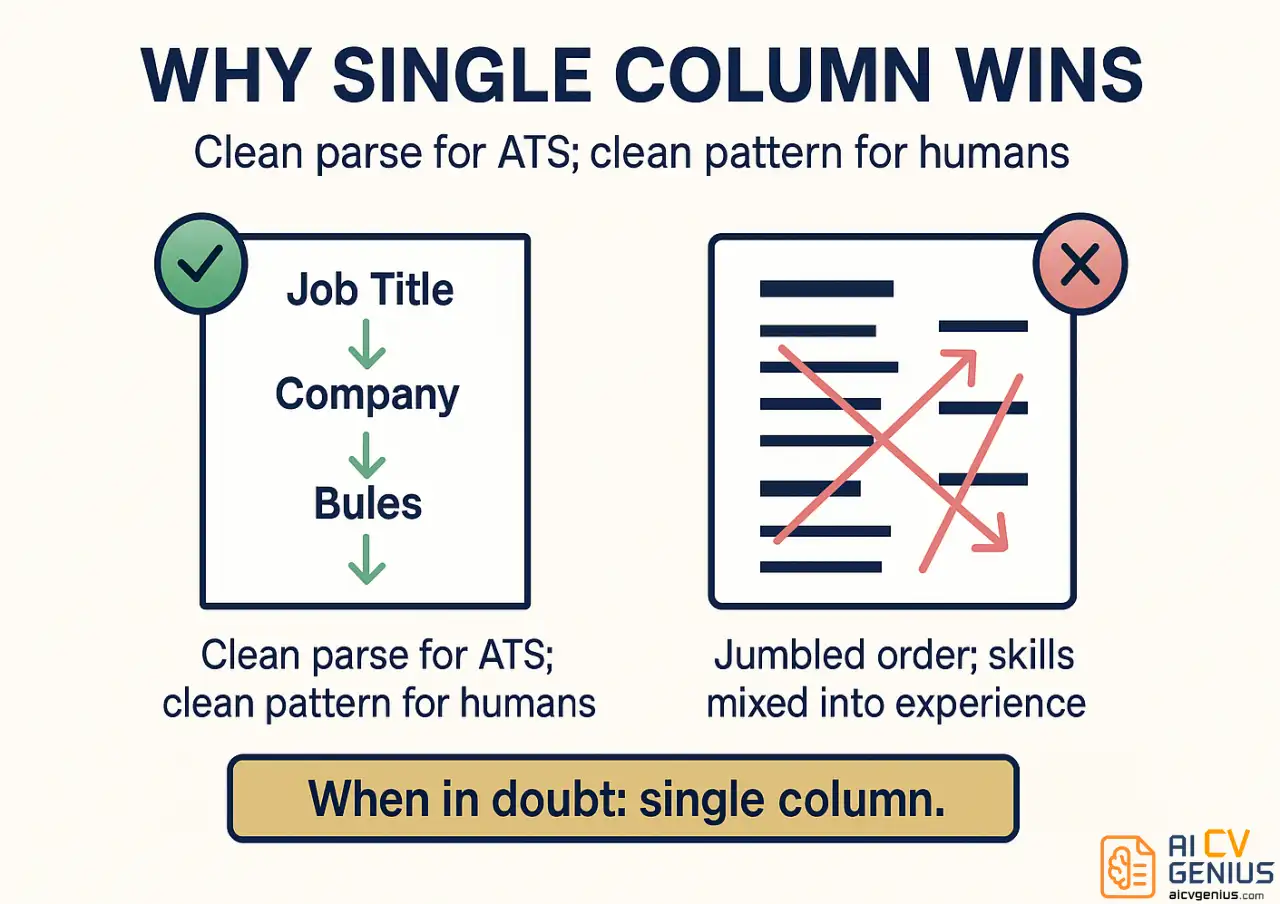
Visual elements like two-column layouts, skill-rating “bubbles,” or tables for organizing information might make your resume look modern and organized to your eyes. But to an ATS, these elements are parsing nightmares.
The system reads text like a human, but a very dumb human. It reads from left to right, then top to bottom. When it encounters a two-column layout, it doesn’t read the left column and then the right column. It reads the first line of the left column, then the first line of the right column, then the second line of the left, and so on, mashing the information into nonsensical, jumbled sentences.
For example, if you have:
(Left Column) Marketing Manager
(Right Column) 2020 – 2023
The ATS will read this as: “Marketing Manager 2020 – 2023.” It fails to recognize “Marketing Manager” as your job title and “2020-2023” as your dates. It just sees one line of jumbled text. Your entire work history becomes unreadable. Graphics, logos, and photos are even worse, as the ATS either ignores them or tries to “read” them as text, resulting in a block of errors.
The Fix:
- ✅ Use a single-column, top-to-bottom layout for your entire resume. This is the single most important formatting rule.
- ✅ Do not use tables for any layout purposes. The only (rare) exception is a simple, invisible-border table for a skills list, but it’s risky and unnecessary.
- ✅ Avoid all graphics, images, logos, or photos. A photo is standard in some countries (like Germany), but for the US, UK, and Canada, it’s unprofessional and an ATS-killer.
- ✅ Do not use skill-rating “bubbles” or “bars.” The ATS cannot read these. Instead of 5/5 stars for “Photoshop,” just write “Photoshop (Expert).”
- ❌ Skip text boxes. These are often ignored by parsers or read out of order.
Simple is always better. A clean, single-column resume with clear section headings will always outperform a visually complex design when it comes to the ATS.
Mistake 4: Inconsistent or Unclear Date Formatting
ATS systems rely heavily on your employment dates. They use them to calculate your total years of experience, the length of time in each role, and to identify potential employment gaps. When your date formats are inconsistent or unclear, the system makes errors – often to your disadvantage.
Let’s say you write “Jan. 2020 – March 2023” for one job and “06/2018 – 12/2019” for another, and “2017-2018” for a third. The ATS struggles to parse these different formats. It might miscalculate your total years of experience, flag your resume as having formatting issues, or fail to understand your career progression.
The Fix:
- ✅ Use one, consistent format: The most reliable is Month YYYY – Month YYYY (e.g., “June 2020 – March 2023”).
- ✅ Alternative (also good): Abbreviated Mon YYYY – Mon YYYY (e.g., “Jun 2020 – Mar 2023”).
- ✅ Always include the month. Don’t just list years (e.g., “2020-2023”). This is a red flag for recruiters, as “2020-2023” could mean 2 years (Dec 2020 – Jan 2023) or 4 years (Jan 2020 – Dec 2023). Be specific.
- ✅ Be consistent with spacing and dashes throughout your entire resume.
- ❌ Avoid: “Jan. 2020,” “2020/01,” or mixing numerical and text-based months.
Pro Tip: If you are still in your current position, use “Present” as the end date (e.g., “Oct 2021 – Present”). This is the most universally recognized term across all ATS platforms. Avoid “Current” or leaving the end date blank.
Mistake 5: Using Non-Standard Section Headings
Getting creative with your section titles might seem like a way to show personality, but it’s a fatal flaw for the ATS. The software is programmed to look for specific, conventional section names. When you label your work history as “My Career Journey” or “Where I’ve Made an Impact,” the system doesn’t know where to categorize that information. It doesn’t find a “Work Experience” section, so it assumes you don’t have any.
Your entire career history can be ignored because you used a “creative” title. For the 6-second human scan, it’s also a problem. Recruiters are scanning for “Work Experience” and “Education.” Making them search for your creative synonym just wastes their time and makes them think you don’t know professional norms.
The Fix:
- ✅ Use these exact standard headings:
- Work Experience (or Professional Experience)
- Education
- Skills (or Technical Skills)
- Certifications
- ✅ Optional standard headings: Professional Summary, Projects, Volunteer Experience, Publications, Awards.
- ❌ Avoid all creative titles: “My Story,” “What I Bring to the Table,” “Life Highlights,” “Career Path,” “My Skillset.”
- ✅ Format them clearly: Use ALL CAPS, Bold, and a slightly larger font (14-16pt) to make them stand out as clear signposts for both the robot and the human.
Save the creativity for your bullet points, where you describe your achievements. Your section headings should be as “boring” and straightforward as possible to ensure the ATS properly categorizes your value.
Mistake 6: Using Acronyms Without Spelling Them Out
You know that “MBA” stands for “Master of Business Administration,” and you assume everyone, including the ATS, does too. But the ATS doesn’t make assumptions; it searches for exact keyword matches from the job description.
If a recruiter sets the ATS to filter for candidates with a “Master of Business Administration,” and your resume only lists “MBA,” you will not appear in the search results. You will be filtered out, even though you have the exact qualification they want.
This is especially problematic with industry-specific certifications (PMP, CPA), software (CRM, ERP), or technical skills. A search for “Certified Public Accountant” won’t return resumes that only list “CPA.”
The Fix:
- ✅ Spell out all acronyms on their first use, followed by the acronym in parentheses.
- ✅ Example 1 (Education): “Master of Business Administration (MBA)”
- ✅ Example 2 (Certification): “Project Management Professional (PMP)”
- ✅ Example 3 (Skill): “Experience with Customer Relationship Management (CRM) software, specifically Salesforce.”
- ✅ For well-known software, this is less critical (everyone knows “Excel”), but when in doubt, spell it out.
This simple practice is a powerful keyword optimization strategy. It ensures your resume appears in searches regardless of whether the recruiter uses the acronym or the full term, effectively doubling your keyword matches.
Mistake 7: Wrong File Format or Unprofessional File Name
This seems basic, but it’s a shockingly common killer. Saving your resume as a JPEG, PNG, or an image-based PDF (like a “picture” of the document) makes it 100% unreadable to an ATS. The system sees an image, not text, and immediately rejects it. Even some older ATS platforms struggle with .docx files that have complex formatting, or .pages files from Apple.
And while we’re talking about files, let’s address naming. When a recruiter downloads your file, what do they see? If it’s “resume.pdf” or “cv_final_v3_updated.docx,” it looks lazy, unprofessional, and gets lost in their downloads folder with 50 other “resume.pdf” files.
The Fix:
- ✅ Use PDF format. This is the 2026 gold standard. It locks in your formatting so it looks the same on every device and is universally readable by modern ATS.
- ✅ Crucial Step: Ensure your PDF is a text-based file, not a scanned image. If you can’t click and drag to highlight the text in your PDF, it’s an image, and it’s useless. Always “Save As PDF” or “Export as PDF” from your text editor (Word, Google Docs).
- ✅ Exception: Only submit a .docx file if the job posting specifically requests it.
- ✅ Professional File Naming: Use this simple, clear convention:
FirstName-LastName-Resume.pdf(e.g.,Sarah-Johnson-Resume.pdf). - ❌ Never use: .jpg, .png, .pages, or generic names like “resume.pdf”.
Mistake 8: Typos and Grammatical Errors
This isn’t just a formatting mistake; it’s a fatal error. According to multiple surveys of hiring managers, 77% would reject a resume with typos or grammatical errors, even for an otherwise qualified candidate. Why? It’s the ultimate sign of carelessness and a lack of attention to detail – a critical soft skill in almost every job.
But beyond the human rejection, typos can also cause ATS problems. A misspelled skill or job title won’t match the keywords the recruiter is searching for.
Imagine you meant to write “project management” but accidentally typed “projcet management.” When the recruiter searches for candidates with “project management” experience, your resume won’t appear. You are filtered out because of a single typo.
The Fix:
- ✅ Proofread. Then proofread again. Then wait an hour and proofread a third time.
- ✅ Use spell-check tools: Grammarly (the free version is excellent), Hemingway Editor, and your built-in word processor tools.
- ✅ Read your resume backwards, from the last word to the first. This forces your brain to look at each word individually and is incredibly effective at catching typos your brain “auto-corrects” when reading forward.
- ✅ Have someone else review it. A fresh pair of eyes will catch mistakes you’ve read 50 times and missed.
- ✅ Print it out. You will spot different errors on a physical piece of paper than you will on a screen.
This isn’t just about looking professional. Every typo is a potential missed keyword match and a reason for instant rejection from both human and robot.
Mistake 9: Bad Margins and White Space Management
This is a human psychology mistake. Trying to fit 15 years of experience onto one page by shrinking margins to 0.3 inches and using 9pt font creates a dense, overwhelming “wall of text.” When the recruiter opens this, their 6-second scan is immediately overloaded. It looks difficult to read, so they simply don’t.
On the flip side, excessive white space – like double-spacing all your bullet points – makes your resume look empty and lacking in substance. Bad margins can also be an ATS problem. If text runs too close to the edges (less than 0.5 inches), some systems can’t read it properly and will cut off words or lines.
The Fix:
- ✅ Use 1-inch margins on all sides as your default. This is the professional standard.
- ✅ Minimum acceptable margins: 0.5 inches. Never go smaller than this, and only use it if you absolutely must.
- ✅ Use single line spacing (1.0 to 1.15) for body text.
- ✅ Add a single empty line (a “space”) between sections and between job entries. This is the “white space” that creates clean separation and guides the reader’s eye.
- ❌ Avoid: Margins smaller than 0.5 inches or larger than 1.2 inches.
If your resume doesn’t fit with proper margins and font size, the answer isn’t to shrink everything. The answer is to edit your content more concisely or move to a second page. A two-page resume is perfectly acceptable (and expected) for professionals with 10+ years of experience. A cramped, unreadable one-page resume is not.
Mistake 10: Inconsistent Formatting Throughout
Nothing screams “lack of attention to detail” like a resume where bullet points randomly switch from circles (•) to dashes (-), some dates are bold while others aren’t, or job titles are sometimes left-aligned and sometimes centered. This inconsistency creates visual chaos and makes you appear careless and disorganized.
For the 6-second scan, this is a killer. The recruiter’s brain is looking for a consistent pattern (Job Title, Company, Date) to follow. When you break that pattern, you break their scan. They have to stop, re-focus, and figure out your new system. They won’t. They’ll just get frustrated and move on.
For the ATS, it’s also a problem. The system learns the pattern from your first job entry. If your second entry uses a different pattern, the parser can fail, misallocating your dates or missing your job title entirely.
The Fix:
- ✅ Choose one bullet style (a solid, round bullet • is the most professional) and stick with it.
- ✅ Format all dates identically: Same format (e.g., “Month YYYY”), same alignment (e.g., right-aligned on the same line as the company), and same style (e.g., bold or not bold).
- ✅ Keep job titles in the same format: e.g., Bold, Italic.
- ✅ Keep company names in the same format: e.g., Bold, Not Italic.
- ✅ Use the same structure for each job entry:
- Company Name, City, State (Right-aligned) Date Range
- Job Title
- (Bullet point)
…and repeat this structure perfectly every time.
- ✅ Apply the same punctuation rules: Either all your bullet points end with a period, or none of them do. (The modern convention is no periods, as they aren’t full sentences).
Create a mini “style guide” for yourself before you start. Decide the format for each element, then apply those rules with obsessive consistency from top to bottom.
How to Fix, Test, and Finalize Your Resume
Before and After: See the Difference
Let’s look at a real example of how these mistakes compound – and how fixing them transforms a resume from an unreadable mess into an interview-generating document.
| Problem Area | Before (Gets Rejected by ATS & Human) | After (Gets Interviews) |
|---|---|---|
| Contact Info | Email and phone in the Word header. | Email, Phone, LinkedIn in the main body, top-center. |
| Font | Papyrus 9pt. Hard to read, not ATS-safe. | Calibri 11pt. Clean, professional, ATS-safe. |
| Layout | Two columns. Skills in a left sidebar. | Single-column, top-to-bottom layout. |
| Dates | “Jan. ’20 – March 2023” and “6/18-12/19” | “Jan 2020 – Mar 2023” and “Jun 2018 – Dec 2019” |
| Section Headers | “My Professional Journey” and “My Skills” | “Work Experience” and “Skills” (Bold, 14pt) |
| Acronyms | “MBA” and “PMP” | “Master of Business Administration (MBA)”, “Project Management Professional (PMP)” |
| File Name | “resume_v3_FINAL_Oct.pdf” | “James-Rodriguez-Resume.pdf” |
Your Pre-Submission Formatting Checklist: The 5-Minute Fix
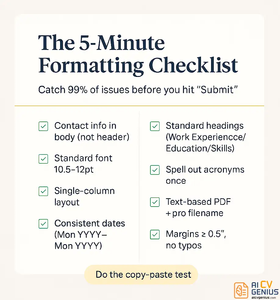
Before you submit your next application, run through this final checklist to catch 99% of all formatting mistakes.
- ☐ Contact Info: Is it in the main body, NOT the header/footer?
- ☐ Font: Is it a standard font (Arial, Calibri, Times, Georgia) sized 10.5-12pt?
- ☐ Layout: Is it a single column? (No sidebars, no text boxes, no graphics).
- ☐ Dates: Is the format 100% consistent? (e.g., “Month YYYY – Month YYYY”).
- ☐ Headers: Are they standard? (“Work Experience,” “Education,” “Skills”).
- ☐ Acronyms: Are they spelled out at least once? (e.g., “Customer Relationship Management (CRM)”).
- ☐ File Format: Is it a text-based PDF? (Test: can you click and highlight the text?).
- ☐ File Name: Is it professional? (“FirstName-LastName-Resume.pdf”).
- ☐ Proofreading: Are there ZERO typos? (Did you read it backwards?).
- ☐ Margins: Are they between 0.5 and 1 inch?
- ☐ Consistency: Are all job titles, company names, and bullets formatted identically?
Taking five minutes to verify these items can be the difference between your resume being seen or being automatically rejected by software you never even knew was evaluating you.
How to Test Your Resume for ATS Compatibility
Want to see what an ATS actually reads from your resume? Don’t guess. Test it. Here are three simple methods to “see” what the robot sees.
Method 1: The Copy-Paste Test (The Easiest)
Open your resume PDF. Press Ctrl+A (or Cmd+A) to “Select All.” Then Ctrl+C (or Cmd+C) to copy. Now, open a plain text editor (like Notepad for Windows or TextEdit for Mac). Paste the content (Ctrl+V or Cmd+V).
Look at the result. Is the text in the correct order? Is your contact info at the top? Is your work history jumbled with your skills section? Are there weird symbols or missing words? If the text is a mess, that’s exactly what the ATS is seeing. This simple test exposes 90% of all column and text-box issues.
Method 2: Online ATS Scanners
Use free or “freemium” tools like Jobscan’s resume scanner or Resume Worded. You can upload your resume, and they will run it through a simulated ATS parser. They will give you a report on formatting issues, missing keywords, and other problems. While some features require payment, the basic formatting check is often free and incredibly insightful.
Method 3: The “Save As .txt” Test
Open your resume in Word or Google Docs. Go to “File” > “Save As” (or “Download”) and choose “Plain Text (.txt)”. Now, open that .txt file. This strips away all formatting, fonts, and columns, leaving you with the raw text data. This is the bare-bones version that an ATS extracts. If critical information is missing, out of order, or garbled, you need to simplify your formatting.
If your resume fails any of these tests, it’s time to simplify. Rebuild it in a single column. Remove the tables. Use standard fonts. Remember: what looks impressive to you might be invisible to the ATS.
FAQs and Final Thoughts
FAQ
Final Thoughts: Formatting Is the Unspoken Interview
The irony is that fixing resume formatting mistakes is actually far easier than gaining the years of experience you’ve worked so hard for. Yet these simple, technical errors are what prevent thousands of qualified candidates from getting interviews every single day. You don’t need to be a graphic designer or a software engineer – you just need to understand that your resume is being read by two very different audiences: a literal-minded robot and a time-starved human.
Here’s your main takeaway: Simple, clean, and consistent formatting always wins. Choose standard fonts. Stick to a single-column layout. Use conventional section headings. Be obsessively consistent. These aren’t restrictions that limit your creativity – they are practical, strategic guidelines that ensure your hard work actually gets seen by the people who can hire you.
Before you submit your next application, spend five minutes running it through the pre-submission checklist. Those five minutes could be the difference between your resume being seen or being automatically rejected by software you never even knew was evaluating you. Your experience and qualifications deserve to be seen – don’t let a simple formatting mistake be the reason they aren’t.
Ready to make your resume stand out for all the right reasons? Check out our complete guide to resume writing for more strategies that get results.