
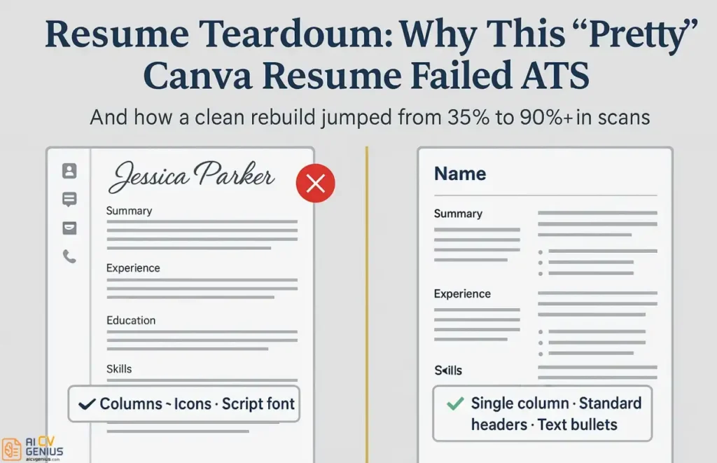
- Avelyne used a stylish Canva resume and applied widely with zero replies: The problem was not her skills, it was that ATS could not read the file correctly.
- Canva resumes fail because they are built like graphic designs: Text boxes, sidebars, icons, and non-standard fonts break the top-to-bottom parsing order.
- The “before” scan shows the damage clearly: Her name got garbled, sections were scrambled, skills became invisible, and the ATS match score crashed to 35%.
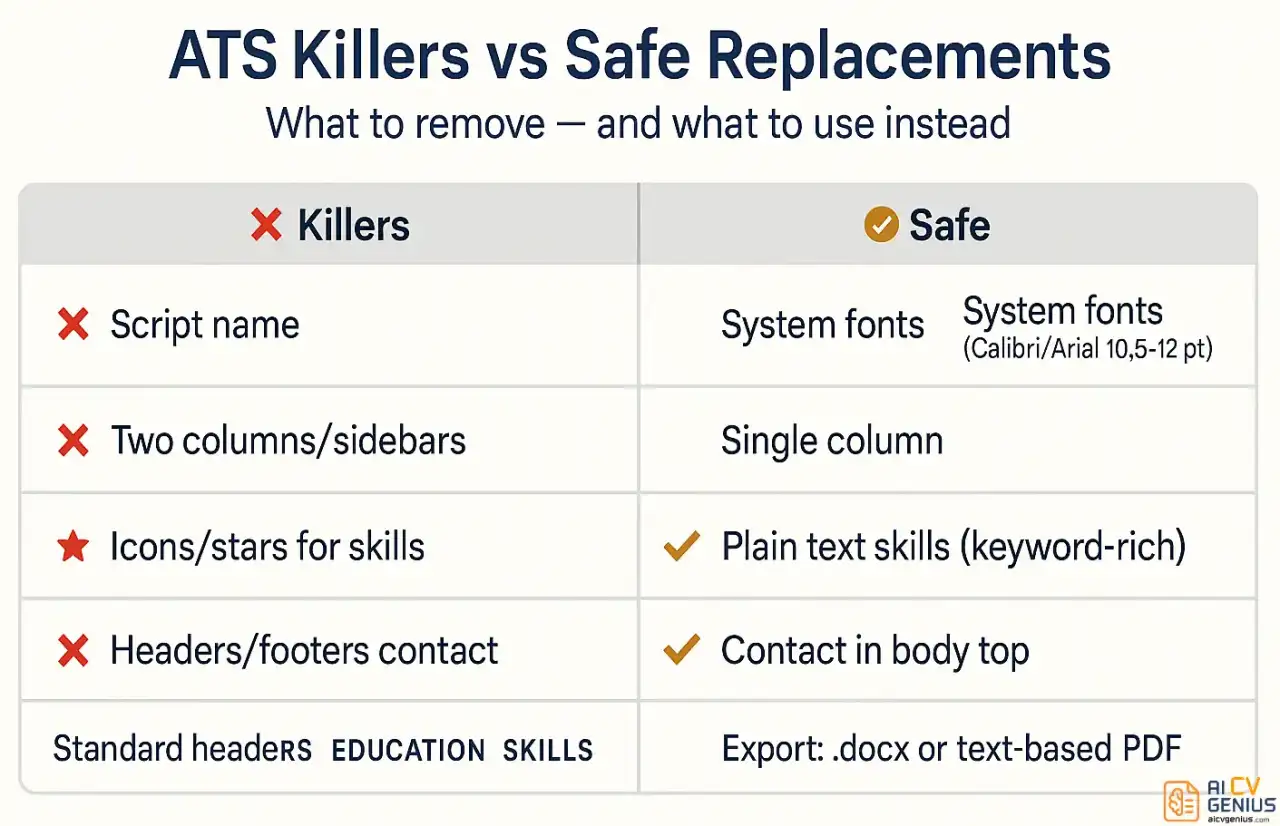
- The rebuild fixes it with boring on purpose choices: Single-column layout, standard headers, universal font, plain text skills, and result-based bullets using a clear X-Y-Z structure.
- The safest takeaway is the two-resume strategy: Use a robot-proof DOCX or text-based PDF for portals, and keep the Canva version only for humans and direct situations.
Avelyne spent three hours on her resume. She picked the prettiest, most creative template on Canva, the one with the stylish sidebar, elegant script font for her name, and sleek icons for her skills. She meticulously arranged every text box, filled in her experience, downloaded the visually stunning PDF, and hit “apply” on 47 jobs. She got zero responses. Not one callback. Not even a rejection email. Just silence.
This isn’t rare. It’s an epidemic. Thousands of highly qualified job seekers unknowingly sabotage their own applications every single day with visually appealing resumes that fail ATS systems completely. The irony is brutal: the prettier and more creative the resume, the worse it often performs in the digital screening process that defines modern hiring. When we ran Avelyne’s Canva resume through an ATS scanner, it scored 35%. The system couldn’t read her name, missed half her work history, and saw none of her skills. Her qualifications, meticulously formatted, were rendered invisible.
This guide is a deep dive into this “pretty vs. practical” paradox. We’re going to tear apart Avelyne’s Canva resume, show you exactly why it failed on a technical level, and then walk you through the step-by-step rebuild that took her score from 35% to 90% – and landed her three interview requests in a single week.
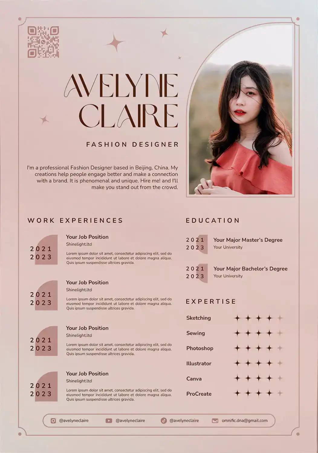
The Problem: What a “Pretty” Resume Hides from a “Dumb” Robot
Avelyne’s resume looked incredible to the human eye. It was clean, modern, and communicated a sense of style and creativity. But here’s the critical disconnect: a human eye was never the first to see it.
The vast majority of medium and large companies (and even many small ones) use Applicant Tracking Systems (ATS) to manage the flood of applications. An ATS is a piece of software, not a person. It doesn’t “see” your resume; it parses it. It’s a robot built to extract raw text – your name, contact info, work history, skills – and slot it into database fields. It then ranks you against other candidates based on keywords from the job description.
If the ATS can’t parse your resume, it can’t extract your information. If it can’t extract your information, it can’t find the keywords. If it can’t find the keywords, it assigns you a low score. And if you get a low score, your resume is automatically filtered into a digital “no” pile. A human recruiter never, ever sees it. You become a ghost in the machine.
A Technical Breakdown: Why Canva Resumes Fail ATS Scans
Canva is a brilliant graphic design tool. It’s not a word processor. It achieves its beautiful layouts using techniques that are poison to an ATS.
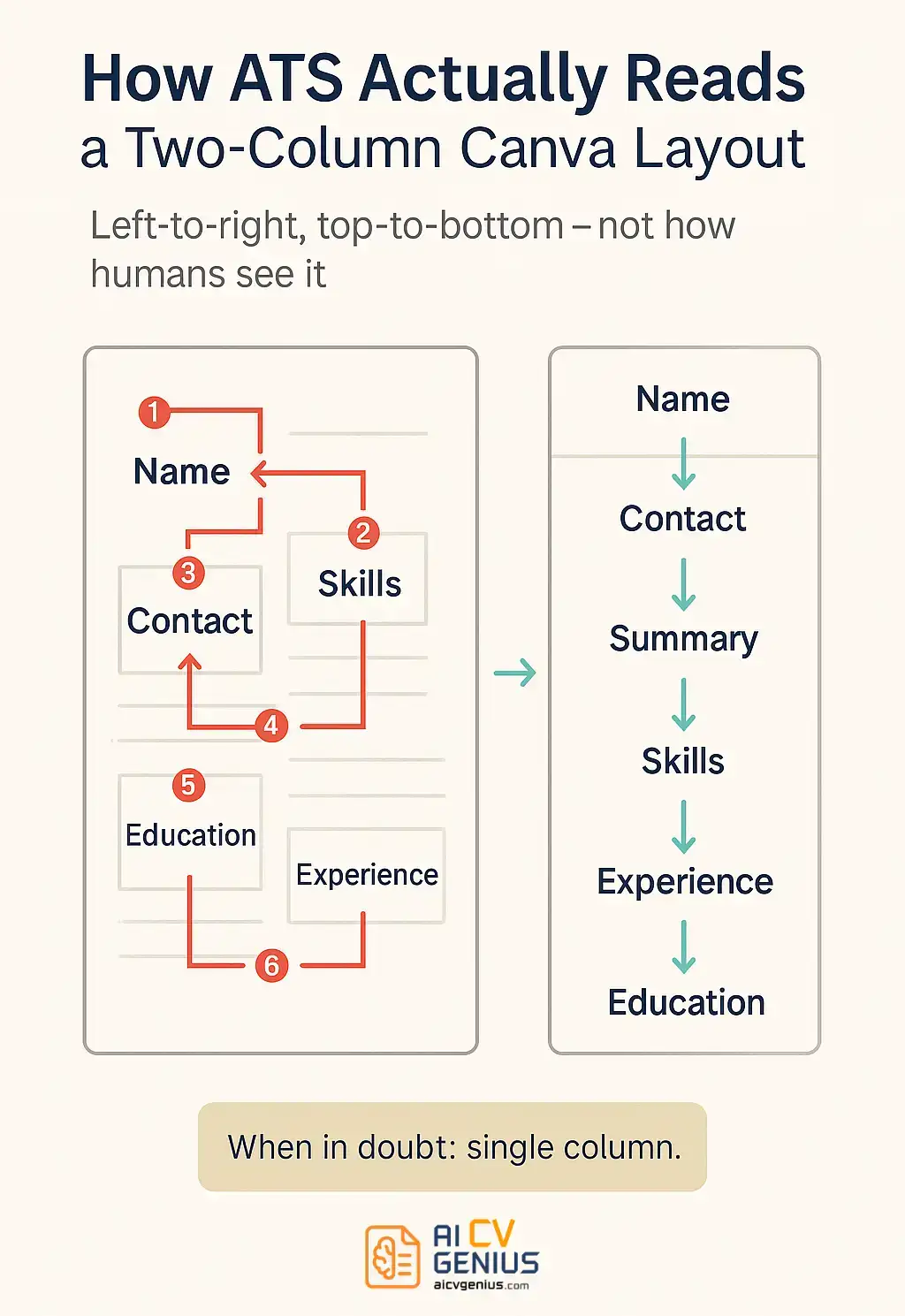
- 1. The Text Box Chaos: Every single piece of text on a Canva template – a job title, a date, a bullet point – sits in its own floating text box. To a human, this creates perfect alignment. To an ATS parser, which reads in a simple top-to-bottom, left-to-right line, it’s chaos. It might read your name, then a bullet point from the middle of the page, then your email address, then a random date. The linear, logical flow of your career is scrambled into nonsense.
- 2. The Two-Column Nightmare: This is the most common killer. Many templates have a stylish sidebar (usually on the left) with contact info, skills, and education. The main column has work experience. An ATS doesn’t see columns. It just reads left-to-right. So, it will try to read all the text in the left sidebar first, from top to bottom, and then read all the text in the right column. The result? Your “Work Experience” section appears to have no contact info or skills associated with it, and your career timeline is completely broken.
- 3. Graphics as Text: The worst offenders use icons, progress bars, or star ratings for skills. Avelyne used 5-star icons to show she was an “expert” in Adobe Photoshop. The ATS parser saw these as images and skipped them. As far as the system was concerned, Avelyne had zero skills listed. Never, ever use a graphic to convey a vital piece of text information.
- 4. Non-Standard Fonts: That elegant, stylized script font for your name? The ATS parser may not have it in its library. It might try to substitute it, fail, and read your name as a string of garbled characters (`N@me: S&r@h J#nes`). Stick to web-safe, universal fonts (we’ll list them later).
- 5. Headers & Footers: Some templates put your contact info in the document’s header or footer to keep it “out of the way.” Many ATS parsers are programmed to ignore headers and footers entirely, assuming they contain trivial information like page numbers. If your phone number and email are in the header, the system might as well be reading an anonymous application.
The “Before” Resume: A Case Study in ATS Failure
Let’s look at a textual breakdown of Avelyne’s original resume. It was a popular two-column template.
Textual Representation of Avelyne’s Canva Resume Layout:
| LEFT COLUMN (Narrow Sidebar) | RIGHT COLUMN (Main Body) |
|---|---|
| [A pretty script font for “Avelyne Jones”] | PROFESSIONAL SUMMARY |
| [Graphic icon of a phone] 555-123-4567 | [Text box] “Dedicated marketing pro…” |
| [Graphic icon of email] Avelyne@email.com | |
| [Graphic icon of web] Avelynejones.com | MY JOURNEY (Creative Header) |
| [Text box] Marketing Manager | |
| EDUCATION | [Text box] Big State University | 2013-2017 |
| B.A. in Communications | • Responsible for social media. |
| • Wrote blog posts. | |
| SKILLS | |
| SEO ⭐⭐⭐⭐ | [Text box] Marketing Intern |
| Photoshop ⭐⭐⭐⭐⭐ | [Text box] Tech Corp | 2016-2017 |
| Email Marketing [Progress Bar 80%] | • Helped with campaigns. |
When an ATS parsed this, here’s what it actually read:
"S?r@h J?nes [PHONE ICON] 555-123-4567 [EMAIL ICON] Avelyne@email.com [WEB ICON] Avelynejones.com EDUCATION B.A. in Communications SKILLS SEO [STAR ICON] [STAR ICON]... Photoshop [STAR ICON]... Email Marketing [PROGRESS BAR] PROFESSIONAL SUMMARY Dedicated marketing pro... MY JOURNEY Marketing Manager Big State University | 2013-2017 Responsible for social media. Wrote blog posts. Marketing Intern Tech Corp | 2016-2017 Helped with campaigns."
It’s a complete disaster. The parser scrambled her name, mashed her contact info and education together, ignored her skills completely, and then read her summary after her skills. It also mixed her first job title (“Marketing Manager”) with her education (“Big State University”). The system, understandably, gave up.
The ATS Test: A 35% Score and a Ticket to the “No” Pile
We ran Avelyne’s Canva resume PDF through Jobscan, a popular ATS simulation tool, against a real job description for a “Marketing Specialist.” The results were brutal, but predictable.
| Category | Score | What Went Wrong & Why It’s a Disaster |
|---|---|---|
| Name & Contact | 60% | The decorative font for her name was partially unreadable. The ATS missed her email and website entirely because of the graphic icons next to them. Disaster: Even if they wanted to, they couldn’t contact her. |
| Work Experience | 25% | The two-column layout completely scrambled the date order. It read “Marketing Manager” and “Big State University” as one job. Disaster: The system thought she was entry-level with a garbled job history. |
| Skills | 10% | The icons (stars) and graphics (progress bars) were 100% invisible to the parser. It only picked up the word “SEO.” Disaster: She didn’t match any of the job’s required skills, like “Photoshop” or “Mailchimp.” |
| Section Headers | 40% | The ATS found “EDUCATION” and “SKILLS” but was completely confused by the creative header “MY JOURNEY.” Disaster: Her entire work history was miscategorized or missed. |
| Overall Compatibility | 35% | An ATS score below 80% means your resume is probably getting filtered out. At 35%, Avelyne never stood a chance. She was invisible. |
For more strategies on getting past ATS systems, check out our guide on resume templates that actually work.
The Fix: A Step-by-Step Rebuild for a 90%+ Score
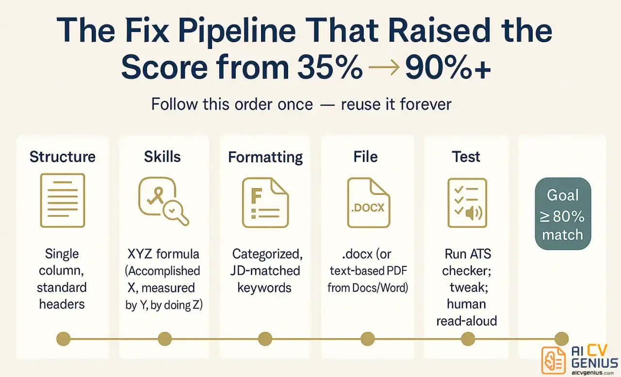
We didn’t just tweak Avelyne’s resume – we rebuilt it from scratch in Google Docs using ATS-friendly principles. Every decision was deliberate, prioritizing clarity and parsability over creative flair.
Step 1: Single Column, Top-to-Bottom Structure
The first and most important change: we switched to a single-column layout. This is the gold standard for ATS compatibility. It ensures the parser reads the information in the exact order you intend, creating a clean, logical narrative.
The new structure was simple and standard:
- Name & Contact Info (at the very top, in the main body)
- Professional Summary
- Skills (Categorized)
- Work Experience (Reverse Chronological)
- Education
This order ensures the ATS (and the human recruiter, who reads in an F-pattern) sees the most important information first.
Step 2: Rewrote Bullet Points from “Responsibilities” to “Results”
Avelyne’s original bullets were passive and weak (“Responsible for…”). We transformed them using the X-Y-Z formula: “Accomplished [X] as measured by [Y], by doing [Z].”
| Before (Weak) | After (Strong) |
|---|---|
| • Responsible for managing social media accounts | • Grew Instagram following by 145% (from 12K to 29K) in 6 months by implementing a data-driven content strategy and consistent twice-daily posting schedule. |
| • Wrote blog posts. | • Authored 12 long-form SEO blog posts (2,000+ words) that achieved first-page Google rankings for 5 key terms and drove a 30% increase in organic traffic. |
| • Helped with campaigns. | • Assisted in the launch of three major email marketing campaigns, contributing to A/B testing that improved our click-through rate by 22%. |
This is the single most powerful change you can make. It reframes you from someone who just did tasks to someone who achieved results.
Step 3: Standard Fonts, Simple Formatting, and Standard Headers
Out went the decorative fonts, colors, and graphics. We rebuilt the entire document using one universal font family.
- Font: Calibri, 11pt (Other safe fonts: Arial, Georgia, Times New Roman, Helvetica, Roboto)
- Headers: We used standard, all-caps headers that the ATS is programmed to find: “PROFESSIONAL SUMMARY,” “SKILLS,” “WORK EXPERIENCE,” “EDUCATION.”
- Formatting: Standard round bullet points (•). No icons, no tables, no graphics.
This might sound “boring,” but it’s not. It’s professional. It’s clean, scannable, and ensures 100% readability for both robots and humans.
Step 4: A Keyword-Rich, Categorized Skills Section
We replaced Avelyne’s invisible star ratings with a powerful, keyword-dense skills section. This is critical for ATS matching. We mirrored the keywords from the job description she was targeting.
New Skills Section:
Technical Skills: SEO/SEM, Google Analytics, Google Ads, Mailchimp, Constant Contact, HubSpot, Salesforce, Adobe Creative Suite (Photoshop, Illustrator)
Marketing Skills: Content Strategy, Social Media Marketing, Email Marketing, Copywriting, A/B Testing, Campaign Management
Professional Skills: Project Management, Client Communication, Team Leadership, Data Analysis
This is clean, scannable, and packed with the exact keywords the ATS is looking for, making her an instant high-match candidate.
Step 5: Saved as a .docx (and a Text-Based PDF)
We saved the new resume as a .docx (Word document). This is the safest, most universally parsable format for almost all ATS systems. We also saved a PDF version from Google Docs, which creates a text-based, searchable PDF (unlike Canva, which can create image-based or layered PDFs).
The new strategy: Apply with the .docx file whenever possible. If a PDF is required, use the text-based one exported from the word processor.
The “After” Resume: Clean, Scannable, and 90% Effective
The rebuilt resume looked different. It was less of a “design project” and more of a “business document.” It was simple, professional, and dense with achievements. And when we ran it through the ATS scanner again, the results were night and day.
The ATS could now read everything. Her name. Her contact info. Every job title, every date, every quantified bullet point. It correctly identified her seven years of experience. It captured all 15 of her listed skills. Most importantly, it ranked her as a 90% match for the role.
Need help restructuring your own resume? Our ATS-friendly resume templates give you a proven starting point.
The Result: From 35% to 90% (And 3 Interview Requests)
The “After” resume was an unqualified success. Here’s the final scorecard.
| Category | Before Score (Canva) | After Score (Rebuild) | Improvement |
|---|---|---|---|
| Name & Contact | 60% (Unreadable) | 100% | +40% |
| Work Experience | 25% (Scrambled) | 95% | +70% |
| Skills | 10% (Ignored) | 90% | +80% |
| Education | 70% (Mixed w/ jobs) | 100% | +30% |
| Overall Score | 35% (Filtered) | 90% (Interview) | +55% |
But the real result came two weeks later. Avelyne sent us this message: “I got three interview requests in five days. Three! After months of getting nothing. One of the recruiters even said, ‘It’s refreshing to see a resume that’s so clear about the results you’ve achieved.’ It wasn’t my qualifications that changed – it was that companies could finally see them.”
If you’re changing careers and worried about your resume, read our post on how to position yourself during a career transition.
The 7 Deadly Sins of Canva Resumes (And How to Avoid Them)
Avelyne’s case isn’t unique. We see these mistakes over and over. Here is a checklist of bad formatting to avoid.
- ❌ Mistake 1: Prioritizing Design Over Content. A resume isn’t a poster. It’s a technical document that has to pass a software test first. Focus on strong, quantified bullet points, not color schemes.
- ❌ Mistake 2: Using Columns or Sidebars. This is the #1 resume-killer. It scrambles the parsing order. Stick to a single column, top to bottom.
- ❌ Mistake 3: Using Graphics for Skills. Star ratings, progress bars, and icons are invisible to an ATS. You will get a 0% skill match. Use plain text lists.
- ❌ Mistake 4: Using Non-Standard Section Headers. The ATS is looking for “Work Experience,” “Education,” and “Skills.” Creative headers like “My Journey,” “Where I’ve Been,” or “What I Bring” will confuse the parser and cause it to skip those sections.
- ❌ Mistake 5: Hiding Contact Info in the Header/Footer. Many parsers are set to ignore headers and footers. Put your name, phone, email, and LinkedIn at the very top of the main document body.
- ❌ Mistake 6: Using Tables for Layout. While some modern ATS can read tables, many cannot. They will linearize the content, turning your neat columns into a jumbled mess. Avoid them.
- ❌ Mistake 7: Choosing a “Pretty” Font. If it’s a script, decorative, or stylized font, delete it. Use Arial, Calibri, Georgia, or another system-standard font.
Want more strategies for optimizing your resume content? Check out our career resources for job seekers.
The “Two-Resume Strategy”: The ONLY Safe Way to Use Canva
So, is Canva evil? Are pretty resumes useless? No. You just need to know when to use them. The key is to have two different resumes:
1. The “ATS Resume” (Your Robot-Proof Version)
- Format: .docx or text-based .pdf (from Word/Google Docs).
- Layout: Single column. No graphics. Standard fonts.
- Purpose: This is the only resume you upload to online portals, job boards, or company career pages. Its only job is to get a 90%+ ATS score and pass the robot filter.
2. The “Human Resume” (Your Pretty Canva Version)
- Format: High-quality PDF from Canva.
- Layout: Visually appealing, well-designed, creative (can have columns, color, etc.).
- Purpose: This is the resume you…
- …bring with you to an in-person interview.
- …hand to a recruiter at a networking event.
- …send in a direct, personal email to a hiring manager after you’ve already applied through the portal.
- …use as your personal portfolio or on your website.
This two-resume strategy gives you the best of both worlds. You conquer the robot filter with the plain version, and you impress the human with the beautiful one. Never, ever mix them up.
FAQ: Your Canva & ATS Questions Answered
Final Thoughts: Stop Sabotaging Your Success
Avelyne’s story is a perfect example of what happens when good qualifications get hidden behind bad formatting. Her beautiful Canva resume looked professional to her, but it failed the ATS completely. The fix wasn’t about adding new experience, lying about skills, or getting another degree. It was simply about translating her existing qualifications into a language the robots could understand.
If you’ve been applying to dozens, or even hundreds, of jobs without hearing back, there is a very high probability that your resume format is the problem. Your resume is not a design project. It is a technical document, and it is the key that unlocks the first gate.
Stop prioritizing “pretty” over “practical.” Adopt the two-resume strategy. Build a simple, single-column, keyword-rich resume in Word or Google Docs for all your online applications. Test it. Ensure it scores above 80% for the jobs you want. Then, and only then, will your real qualifications get the chance to shine in front of a human. You don’t need a resume that looks the best – you need one that works the best.
Ready to build a resume that actually passes ATS systems? Explore our collection of ATS-friendly templates and guides.