
- Main argument: A two-page resume is often a strategic advantage because it adds context, proof, and a stronger narrative than a cramped one-page version.
- When to use two pages: 10+ years of relevant experience, technical or complex roles, leadership scope, career change translation, or project-heavy work.
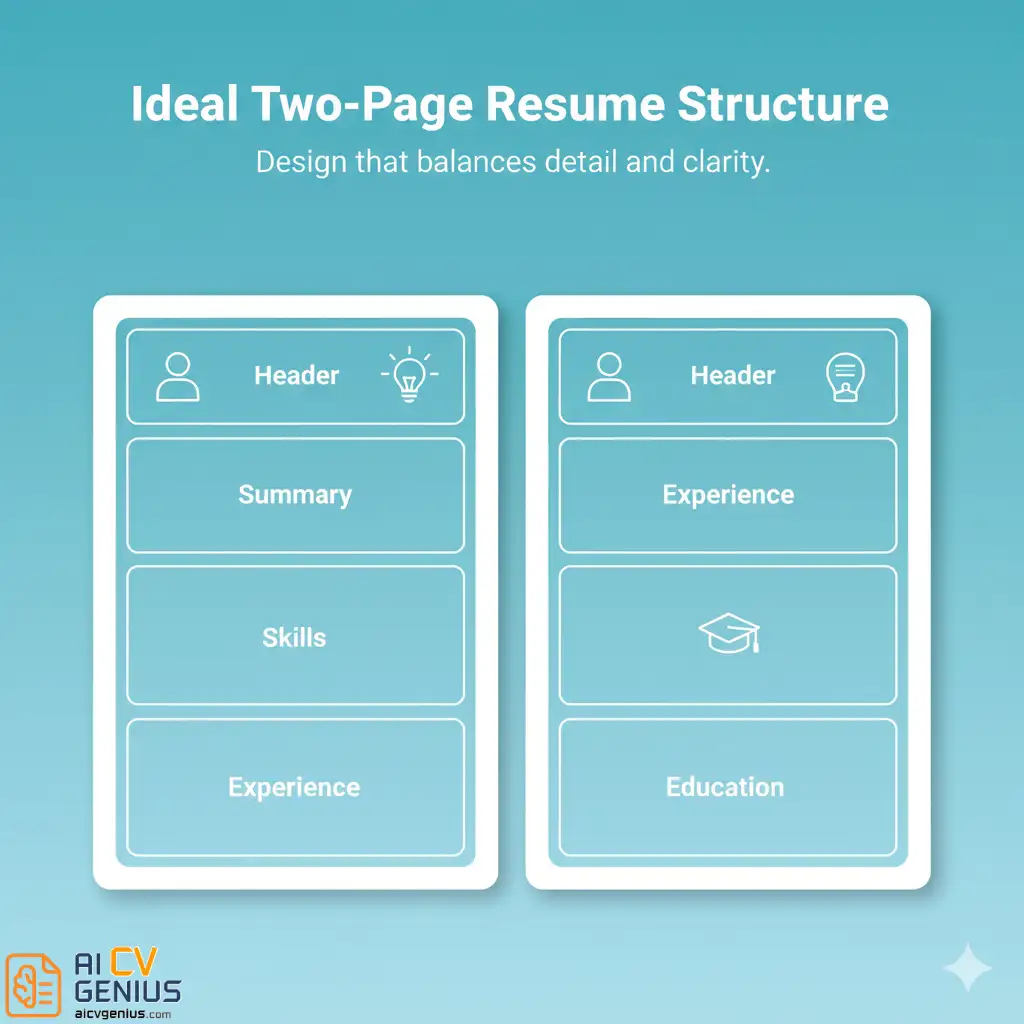
- Best structure: Page 1 is the hook with summary, skills, and strongest recent achievements, Page 2 is proof with older relevant roles, education, certifications, and optional projects.
- Formatting rules that keep it readable: Consistent margins, one clean font, consistent spacing, a clear Page 2 header, and enough whitespace to avoid text walls.
- ATS and submission essentials: Keep keywords natural, avoid messy page breaks and risky columns for ATS applications, export as a clean PDF, and cut fluff so every line earns its place.
The Great One-Page Resume Debate: Why a Two-Page Format Is Now a Strategic Advantage
For decades, job seekers were haunted by a single, rigid piece of advice: “Your resume must be one page. No exceptions.” This rule was hammered into us by career counselors, repeated in business schools, and treated as gospel. But today, in a world of complex, multi-faceted careers, that rule is not just outdated – it can be a critical mistake.
If you have built a career of substance, trying to compress 15 years of achievements, projects, and leadership into one cramped page is not a sign of efficiency. It is a sign of compromise. A well-structured two page resume format is not a sign of indulgence; it is a sign of confidence. It shows you have a story so compelling it requires the proper space to be told.
Recruiters no longer read on paper. They scroll on screens. They use filters, scan for keywords, and crave context. A second page gives you the room to provide that context, to quantify your impact, and to build a narrative that a single page can only hint at. The key is no longer brevity at all costs. The key is relevance, clarity, and making every single line earn its place.
“A one-page resume shows what you did. A two-page resume, done right, shows what you are worth.”
When a Two-Page Resume Is the Right Strategic Choice (Use Cases You Shouldn’t Ignore)
When Two Pages Are Not Just Acceptable, But Necessary
A two-page resume is not about filling space; it is about providing proof. It is the correct strategic choice if you fall into one or more of these categories:
- ✅ You Have 10+ Years of Relevant Experience: This is the clearest indicator. If you are a mid-career or senior professional, you simply have too many achievements, leadership roles, and quantifiable results to fit on one page without sacrificing readability.
- ✅ You Are in a Technical or Complex Field: Professionals in IT, engineering, academia, healthcare (like research scientists or senior nurses), and project management need space. You must detail projects, technical stacks, publications, or complex methodologies.
- ✅ You Are a Leader or Manager: Leadership is not a single bullet point. It requires space to show team size, budgets managed, strategic initiatives led, and mentorship outcomes.
- ✅ You Are Making a Strategic Career Change: A longer resume gives you room to “translate” your past experience, showing how your skills from a previous industry (e.g., teaching) directly apply to your new one (e.g., project management).
- ✅ You Have a Project-Heavy Career: Consultants, freelancers, and creatives (like designers or writers) live by their projects. A second page is essential for detailing these projects and their specific outcomes.
For recent graduates, entry-level candidates, or those with less than 5-7 years in one field, one page remains the gold standard. But if your experience tells a richer story, a second page is your canvas – provided you format it for a 6-second scan.
Structure & Readability: Building a Two-Page Resume That Actually Gets Read
The Ideal Structure: How to Organize a Professional Two Page Resume Format
The cardinal rule of a two-page resume is simple: Page one must be so strong that it compels the recruiter to read page two. Your first page is your highlight reel. Your second page is the supporting evidence.
Here is the most effective structure to ensure your resume reads cleanly and strategically.
| Page | Sections (In Order) | Core Purpose & Psychology |
|---|---|---|
| Page 1: The “Hook” | 1. Header: Name, Title, Contact Info, LinkedIn. 2. Professional Summary: Your 3-line elevator pitch. This is critical. It must summarize your entire value proposition. 3. Core Competencies / Skills: A bulleted, keyword-rich section for ATS scanning. 4. Professional Experience (Part 1): Your most recent and most relevant role(s). This section must be powerful, packed with quantifiable achievements. | To prove your value in 10 seconds. This page must be strong enough to stand on its own. It answers the question, “Are you qualified?” |
| Page 2: The “Proof” | 1. Header (Mini): Your Name & Page 2 (e.g., “Jane Doe, Page 2”). 2. Professional Experience (Part 2): Older, but still relevant roles (typically beyond the 10-15 year mark). 3. Education: Degrees, university. 4. Certifications & Professional Development: Industry-specific certs (PMP, AWS, etc.). 5. (Optional) Projects, Publications, or Volunteer Work: Only if highly relevant to the role. | To provide depth and build credibility. This page answers the question, “How deep does your experience go?” It supports your summary’s claims. |
If your first page does not contain your summary, skills, and your absolute best, most recent achievements, the recruiter will never get to page two. The top third of Page 1 is the most valuable real estate you own – use it wisely.
Layout Rules That Keep It Professional: The Art of Readability
Formatting is not just decoration; it is storytelling through design. It is the first signal you send of being organized, professional, and clear-thinking. Many two page resume layout examples succeed or fail based on these visual rules.
- ✅ Use Consistent Margins: Stick to 0.5 to 0.75 inches on all sides. This maximizes space without making the page feel claustrophobic.
- ✅ Choose One Readable Font Family: Do not get fancy. Stick to sans-serif fonts like Inter, Lato, Calibri, or Roboto. Use 10-12 pt for body text and 14-18 pt for section headers.
- ✅ Maintain Consistent Spacing: The space between your job title and your bullet points should be identical for every entry, on both pages. Consistency builds trust.
- ✅ Add a Page 2 Header: This is non-negotiable. At the top of the second page, add a simple header: “Your Name | Page 2” or “Your Name | Contact Info”. This is crucial in case the pages get separated (even digitally).
- ✅ Leverage Whitespace: Do not fear whitespace! It is not “wasted” space; it is a design tool that guides the reader’s eye and prevents fatigue. Use it to frame your sections.
Simple, clean formatting communicates confidence. Avoid “text walls” – dense blocks of text with no breaks. Break sections with subtle horizontal lines or just clean whitespace. If you want professional starting points, you can explore ready-made layouts in AI CV Genius resume templates, which are all designed for readability.
The 6-Second Rule Still Applies (Even With Two Pages)
Do not make the mistake of thinking two pages buys you more time. It does not. Recruiters still make their initial “yes/no” decision in about six seconds. This scan is purely to determine if you are worth a deeper read.
Your job is to make your structure intuitive. The recruiter’s eyes must instantly find:
- Your Name and Current Title
- Your Professional Summary
- Your Most Recent Company and Dates
- Your Skills/Keywords
If they can find these four things in six seconds, they will slow down and read your achievement bullets. Use bolding for job titles, clear section headings, and data-driven results to make this scan effortless.
“Two pages are fine – but every single line must earn its place on the page.”
Think of your resume like a portfolio, not a diary. It is not about listing every single task you have ever done. It is about curating the most powerful evidence that proves you can solve the next employer’s problems.
Writing for Skim-Readers: The Art of the Powerful Bullet Point
Most recruiters do not read top-to-bottom. They scan, hunt for keywords, and let their eyes jump to what matters. To win them over, your writing must be optimized for scanning.
- ✅ Start with Strong Verbs: Never start a bullet with “Responsible for…” or “Duties included…”. Start with a powerful action verb: “Led,” “Developed,” “Managed,” “Streamlined,” “Negotiated.”
- ✅ Quantify Everything Possible: Numbers are your proof. They cut through the noise. “Increased revenue by 20%” is infinitely stronger than “Increased revenue.” Find numbers for time, money, or scale (%, $, #).
- ✅ Use Short Paragraphs: For your Professional Summary, keep it to 2-3 lines max. Bullet points should also be 1-2 lines.
- ✅ Keep Page 1 Your “Best Of”: Your most relevant, impressive, and recent information must be on Page 1. Page 2 is for supporting details, not the main event.
If you are unsure what stays or goes, open the job description. Your resume should be a direct answer to that document. Prioritize achievements that align with their “Requirements” section. You can find practical writing examples in career resources for resume storytelling techniques.
How to Break Between Pages: The Worst Two-Page Resume Mistake
The biggest and most amateurish challenge in how to write a two page resume is the page break. This is where most people fail.
The Cardinal Rule: NEVER, EVER split a single section (especially a job entry) across two pages. Do not have your job title and half your bullets on Page 1, with the rest of the bullets on Page 2. It looks messy, unprofessional, and is a nightmare to read.
Each page must feel like a complete, self-contained thought. The page break should happen between sections.
| ❌ The Wrong Way (Looks Broken) | ✅ The Right Way (Looks Intentional) |
|---|---|
| Page 1 ends mid-way through your “Senior Manager” role. The reader has to flip to Page 2 to finish your thoughts. | Page 1 contains your Summary, Skills, and your full “Senior Manager” and “Manager” roles. Page 2 starts with your “Associate” role. |
| Page 2 is only 1/4 full, with a tiny “Education” section. It looks like an afterthought and feels empty. | Balance the content. If Page 2 is light, add a “Key Projects” or “Professional Development” section to provide more value and balance the layout. |
Consistency is everything. The second page must feel like a deliberate and necessary continuation, not a sloppy overflow.
Using Columns and Grids: A Modern (But Risky) Approach
Modern resume builders and templates often use flexible grids or two-column layouts. These can be excellent for a two page resume layout, but they come with a major risk: Applicant Tracking Systems (ATS).
Many older ATS bots cannot read columns. They read left-to-right, top-to-bottom. A two-column layout can scramble your information, making “Skills” and “Experience” merge into nonsense.
The Safe Strategy:
- For Online Applications (The ATS): Use a single-column, traditional format. This ensures 100% readability by the bots.
- For Networking (The Human): Use your beautifully designed two-column, two-page resume. This is the one you email directly to a recruiter, bring to an interview, or post on your personal website.
If you must use a two-column layout for an ATS, ensure the main body (your Experience) is in one wide, primary column, and a smaller sidebar is used only for secondary info like “Skills” or “Contact.”
Common Two-Page Design Mistakes to Avoid
A second page magnifies any design flaw. Here is what to avoid.
| ❌ The Mistake | ✅ The Fix | ✅ The Fix |
|---|---|---|
| The “Fluff Fill” | Filling Page 2 with irrelevant tasks, high school jobs, or vague “soft skills” lists. This screams “I’m padding my resume.” | Cut relentlessly. Focus on measurable impact. If a bullet point does not show a result or a core skill, delete it. |
| Inconsistent Formatting | Using different spacing, font sizes, or bullet styles on Page 2. This breaks the visual flow and looks sloppy. | Use identical styles. Your section headers, margins, and spacing must be exactly the same on both pages. |
| Font Size Too Small | Shrinking the font to 9pt to force everything onto two pages. This is unreadable and looks desperate. | Use 10-12 pt. If it does not fit, you have a content problem, not a font problem. Cut weaker content. |
| Ignoring Whitespace | Creating a dense “wall of text” to show how much you’ve done. This causes reader fatigue, and they will just skip it. | Whitespace is your friend. It frames information, creates emphasis, and signals an organized mind. |
Strategy, Narrative & Alignment: Tailoring, Keywords, and Submission Best Practices
Balancing Story and Structure: The Narrative Hierarchy
A resume is not just a design; it is a narrative hierarchy. You are telling a story in a specific visual order, designed to build trust and prove competence.
1️⃣Page 1 is the “Headline” and “Lead Story”: It answers “Who are you?” and “What can you do for me now?” It must be packed with your most impressive, relevant achievements. This is where you hook them.
2️⃣Page 2 is the “Supporting Evidence” and “Backstory”: It answers “Where did you come from?” and “How deep does your expertise go?” This is where you build credibility with supporting roles, education, and certifications.
The second page gives you room for detail, but your first page must always deliver your core message. Treat Page 1 like your professional summary – the rest just supports it.

Tailoring Each Page to the Role (The 70/30 Rule)
Not every recruiter will read both pages. You must assume some will only read Page 1. That is why Page 1 should contain at least 70% of the information needed to get you an interview. Page 2 contains the other 30% – the deep-dive details for the interested reader.
For every job you apply to, re-evaluate your pages:
- For a Senior Leadership Role: Page 1 should be heavy on strategy, team leadership, and P&L management. Page 2 can support with older roles or foundational projects.
- For a Technical Role: Page 1 must have your “Technical Skills” section and projects that used that stack. Page 2 can list older tech stacks, education, and certifications.
- For a Creative Role: Page 1 needs a link to your portfolio (in the header!) and bullets on project outcomes. Page 2 can detail the tools you used or list more projects.
Keywords and ATS Strategy for Two Pages
Good news: Applicant Tracking Systems (ATS) do not care about page breaks. They will scan both pages and parse all the text. This gives you a slight advantage: more space to naturally include relevant keywords.
Strategy:
- Seed Keywords Naturally: Read the job description. If it mentions “project management,” “data analysis,” and “stakeholder communication,” ensure these phrases appear naturally in your Summary and Experience bullets on both pages.
- Do Not Overstuff: Do not just list keywords in a hidden white font (an old, black-hat trick that gets you blacklisted). The ATS is smart enough to look for keywords in context. “Managed a project” is better than a list that just says “Project Management.”
- Use a “Core Competencies” Section: This section on Page 1 is your best friend for ATS. It is a simple, scannable, bullet-point list of your most relevant hard and soft skills.
If you are updating your resume after years, read resume formatting guides to understand current standards for keyword density and ATS-friendly headers.
Printing vs. Digital Submission: The PDF Is King
In 99% of cases, you will be submitting your resume as a PDF. This is ideal, as it locks in your formatting, fonts, and page breaks exactly as you intended.
- For Digital Submission: Always save as a PDF. Name it professionally (e.g., “JaneDoe_Resume_ProjectManager.pdf”). Do not submit a .docx file, as it can reformat itself on the recruiter’s computer.
- For Printing (The Interview): If you bring a physical copy to an interview, print both pages (preferably on slightly heavier resume paper). Do not print double-sided. Hand them two separate, single-sided sheets, un-stapled.
Always test your PDF export before submitting. A misaligned header or a broken link can instantly break professionalism.
Proof & Credibility: Seeing the Difference and Earning Trust
Real-World Examples: Overloaded vs. Optimized
Let’s compare two approaches for a 15-year marketing veteran.
| ❌ The Overloaded Resume (Weak) | ✅ The Optimized Two-Page Resume (Strong) |
|---|---|
| Tries to force 15 years onto one page. Uses 9pt font and 0.25″ margins. It’s a wall of text. | Uses two pages with clean 0.75″ margins and 11pt font. Page 1 has Summary, Skills, and the last 8 years. Page 2 has older roles & education. |
| Lists every job since college, including an internship from 2008. No metrics, just “duties.” | Highlights key achievements for the last 10-15 years. Older roles are summarized or cut. Every bullet has a metric. |
| The layout is dense, fatiguing, and screams “I don’t know how to prioritize.” | The layout is clean, balanced, and uses whitespace. It screams “I am an organized, confident professional.” |
Formatting should feel invisible. The recruiter should focus on your content, not struggle with your container.
Why Two Pages Build Credibility (When Done Right)
For mid- to senior-level roles, a single page can, paradoxically, look shallow or inexperienced. It can signal that you either do not have enough achievements to fill the space or do not know how to articulate them.
A well-crafted two-page resume shows confidence: you know your story is worth the space. It also signals maturity – you understand the difference between brevity (good) and compression (bad). You value depth and clarity over arbitrary rules.
“It’s not the length of your resume that matters – it’s the weight of the achievements inside it.”
That is why recruiters for management, technical, and strategic positions often prefer a structured two-page resume. It gives them the complete picture they need to make an informed decision.
Your Final Pass: Checklist, FAQs, and Closing Guidance
Two-Page Resume Final Checklist
- ✅ The 10-Year Rule: Do you have 10+ years of relevant experience? If yes, proceed.
- ✅ Page 1 Strength: Does Page 1 contain your Summary, Skills, and best achievements? Can it stand alone?
- ✅ Page 2 Header: Does Page 2 have your name and “Page 2” at the top?
- ✅ No Broken Sections: Is the page break clean (between sections, not in the middle of one)?
- ✅ Visual Consistency: Are the fonts, margins, and spacing identical on both pages?
- ✅ Relevance over Length: Is every line on Page 2 earning its spot? (No fluff!)
- ✅ ATS-Friendly: Is it a single-column layout (or a safe two-column) saved as a PDF?
In-Depth FAQs on Two-Page Resumes
Final Thoughts: Own Your Story
A two page resume format is not about breaking rules – it is about choosing the right tool for the job. Your career story has depth, and you should not apologize for it. The extra space is not for fluff; it is for clarity, context, and proof.
When you craft it right, your two-page resume reads effortlessly. It presents a confident, structured, and comprehensive narrative of your professional journey. It stops being about page length and starts being about the confidence and clarity of your story.