
- Font choice shapes first impression and scan speed: The wrong font hurts readability, while the right one supports clarity, professionalism, and ATS parsing.
- Choose fonts by role context: Sans-serif fits most modern corporate roles, modern sans-serif fits creative or tech-forward roles, and classic serif fits conservative industries like law and finance.
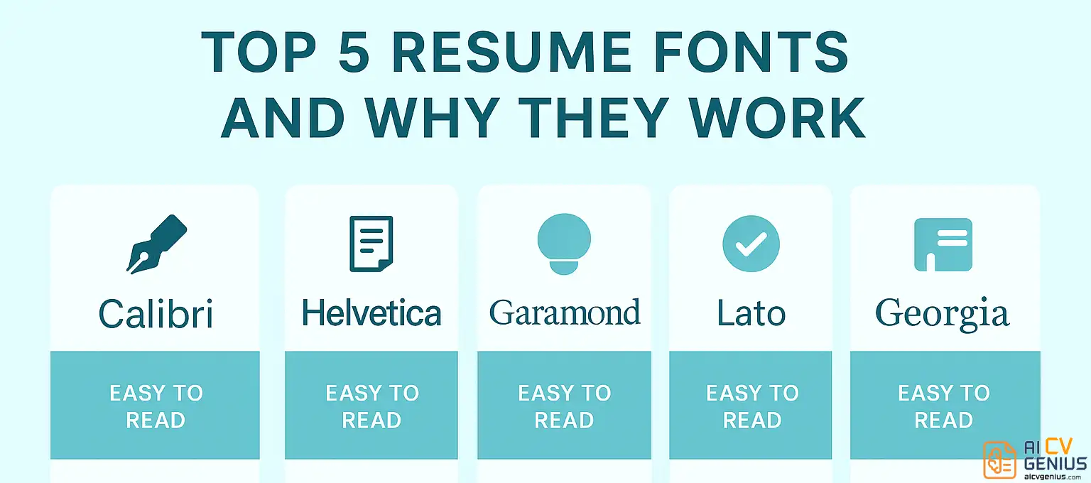
- Safe, proven resume fonts repeat across the guide: Calibri, Helvetica, Lato, Garamond, Georgia, Nunito, and Arial are highlighted for readability and ATS compatibility.
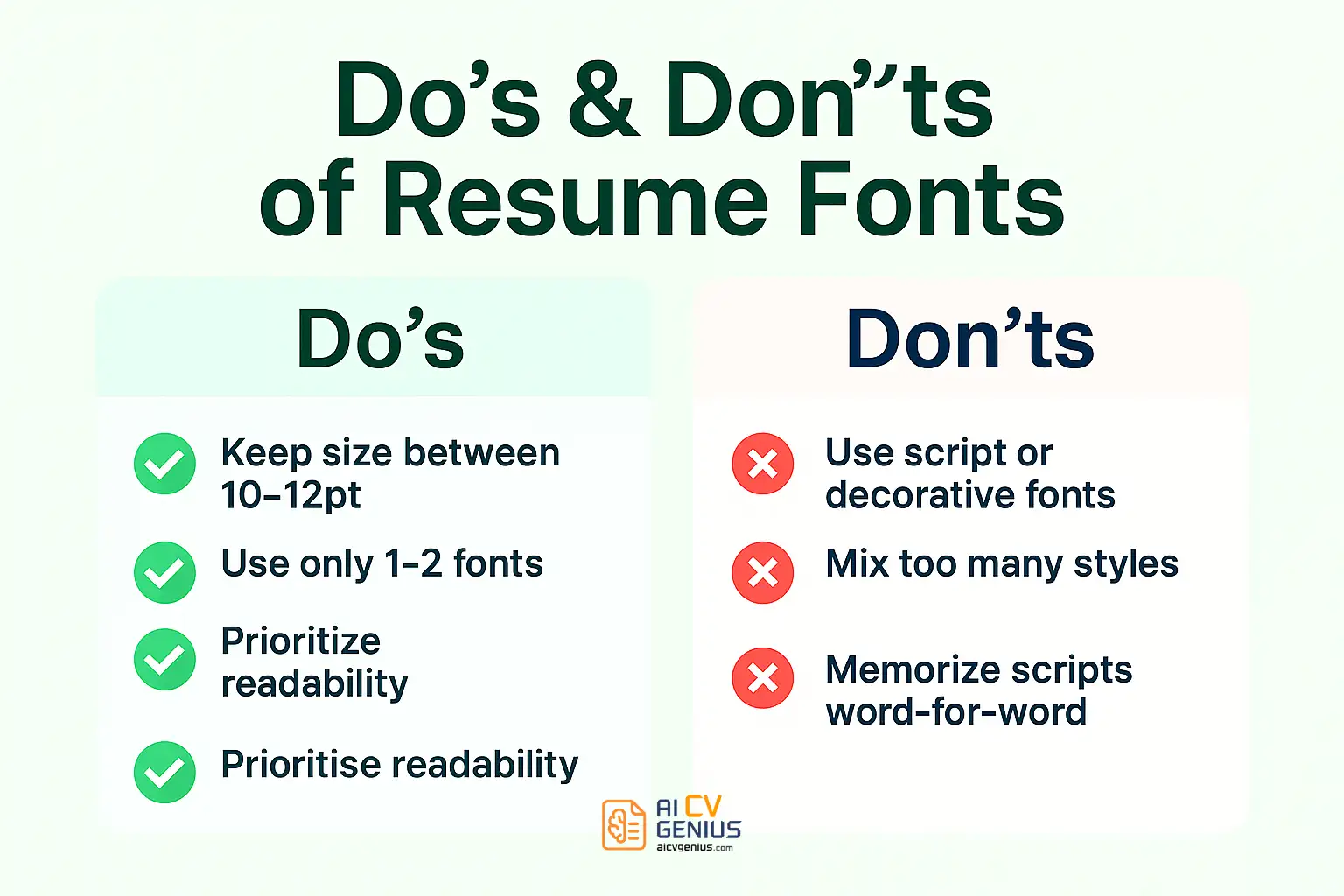
- Formatting matters as much as the font: Body text should stay around 10 to 12 pt, headings around 14 to 16 pt, with consistent weights, sensible spacing, and 0.5 to 1 inch margins.
- Avoid fonts that reduce trust or break parsing: Decorative scripts, overly condensed fonts, monospaced typewriter styles, and novelty picks like Comic Sans are flagged as risky.
The right font selection can subtly yet significantly influence your resume’s impact. It’s often the first, unspoken design decision that signals to recruiters whether you possess meticulous attention to detail, inherent professionalism, and contemporary awareness – all before they process a single word of your experience. A thoughtfully chosen resume font harmonizes clarity, projects confidence, and enhances your overall professional brand without demanding undue attention.
Selecting the best fonts for resumes transcends mere personal aesthetic preference – it revolves around ensuring optimal readability, maintaining unwavering consistency, and crucially, guaranteeing compatibility with pervasive Applicant Tracking Systems (ATS). Let’s explore precisely how to select the ideal font to articulate your unique career story and understand why this seemingly minor detail carries far more weight than commonly perceived.
Why Font Choice Matters Critically in a Resume
Recruiters typically dedicate mere seconds to the initial scan of each resume. An inappropriate font choice – whether excessively small, overly ornate, or densely spaced – impedes this rapid review process. Conversely, an optimal font facilitates natural eye movement, effortlessly guiding the reader toward your most significant qualifications: your professional experience and quantifiable achievements.
- ✅ Immediately establishes a professional and polished visual impression.
- ✅ Significantly enhances readability across both digital screens and physical printouts.
- ✅ Critically ensures compatibility with Applicant Tracking Systems (ATS) parsing software.
- ✅ Subtly reflects and reinforces your intended personal brand positioning (e.g., modern innovator, classic professional, creative thinker).
Consider font choice the underlying tone of your resume’s voice: it should ideally project calmness, convey confidence, and facilitate effortless comprehension.
How to Choose the Right Font for Your Resume Strategically
Fonts subtly convey the overall tone and context of your application. A creative graphic designer and a corporate financial analyst logically shouldn’t employ identical typography – and that strategic differentiation is precisely the point. Here’s how to select a font that aligns effectively with your specific professional narrative:
- Most Corporate/Professional Roles (e.g., Business, Admin, HR): Prioritize clean, standard sans-serif fonts like Calibri, Lato, Helvetica, or Arial. These signal modernity and clarity.
- Creative or Tech-Forward Roles (e.g., Marketing, Design, Startups): Consider modern yet highly readable sans-serif options like Lato, Nunito, Raleway, or Roboto. These feel contemporary without sacrificing professionalism.
- Traditional or Conservative Industries (e.g., Law, Finance, Academia, Government): Classic serif fonts such as Garamond, Georgia, or Cambria project established credibility, authority, and trustworthiness.
Regardless of your chosen font family, rigorously ensure it meets these fundamental criteria:
- ✅ Remains exceptionally easy to read in both standard PDF and potentially DOCX (Word) formats across different devices.
- ✅ Renders clearly at typical resume font sizes: 10–12 points for main body text, and 14–16 points for major section headings.
- ✅ Usage is strictly consistent – never mix more than two complementary fonts (one for headings, one for body text is the maximum recommended). Maintain font weight consistency.
- ✅ Is widely available or web-safe to prevent rendering issues on the recipient’s system. Stick to common system fonts or reliable Google Fonts.
Top 7 Fonts for Resumes (And Why They Consistently Work)
Here are the most trusted and frequently recommended resume fonts utilized by professionals globally – rigorously tested for style, optimal readability, and crucial ATS-friendliness.
Calibri – The Contemporary Standard
Microsoft’s clean sans-serif default since Office 2007, Calibri is unobtrusive, exceptionally easy to read digitally, and maintains a neutral yet professional tone. It represents a safe, universally accepted choice suitable for nearly any industry – particularly advantageous if submitting in Word format (.docx) where compatibility is guaranteed.
- ✅ Highly readable on screens and clearly legible when printed.
- ✅ Universally supported across virtually all modern operating systems.
- ✅ Excellent choice for entry-level through mid-level professional roles across diverse sectors.
Font Calibri is Best for: General corporate positions, administrative roles, human resources, operations, and IT support resumes where clarity is paramount.
Helvetica – The Design Professional’s Go-To
Helvetica’s clean geometric lines, balanced character spacing, and inherent neutrality make it a timeless design classic. It projects confidence and sophistication without appearing ostentatious. Recruiters appreciate its exceptional legibility, even at smaller point sizes frequently used in dense resumes.
- ✅ Elegant, minimalist aesthetic conveying precision and clarity.
- ✅ Renders crisply in both high-resolution PDF exports and professional printouts.
- ✅ Subtly communicates trustworthiness and structured thinking.
Font Helvetica is Best for: Marketing and advertising roles, graphic design portfolios (when paired thoughtfully), consulting proposals, and executive-level resumes demanding a polished, authoritative feel.
Lato – The Approachable Professional (Web-Optimized)
Lato, a widely available Google Font, was intentionally designed to harmonize warmth and stability – resulting in a modern sans-serif that feels both professional and approachable. Its excellent screen rendering makes it particularly popular among startups, digital agencies, and creative professionals.
- ✅ Functions exceptionally well for both impactful headings and readable body text.
- ✅ Pairs effectively with minimalist, contemporary resume layouts utilizing ample white space.
- ✅ Natively compatible with Google Docs and widely used in online design tools like Canva.
Font Lato is Best for: Technology sector roles (software development, UX/UI), communications professionals, marketing specialists, and candidates applying to companies with modern or innovative brand identities.
Garamond – The Timeless Classic (Serif)
Elegant, refined, and deeply traditional, Garamond is a classic serif font family exuding extensive experience, established professionalism, and intellectual rigor. Its slightly condensed letterforms make it ideal for text-heavy resumes requiring significant detail without sacrificing readability, provided adequate line spacing is maintained.
- ✅ Highly effective for presenting substantial amounts of text concisely yet elegantly.
- ✅ Projects a refined, mature, and authoritative professional image.
- ✅ Perfectly suited for academic CVs, legal briefs, research proposals, and senior executive applications in conservative fields.
Font Garamond is Best for: Education sector positions (professors, researchers), legal professionals (attorneys, paralegals), scientific roles, and senior-level applications within traditional industries.
Georgia – The Reliable Digital Standard (Serif)
Georgia represents another highly dependable serif font option, specifically engineered by Microsoft for optimal on-screen readability. It strikes a balance between traditional structure and digital clarity, feeling slightly friendlier and more open than Garamond while retaining unequivocal professionalism.
- ✅ Maintains strong readability even at smaller point sizes, beneficial for fitting content.
- ✅ Recognized as highly ATS-friendly and universally supported across platforms.
- ✅ Conveys trustworthiness, stability, and approachability.
Font Georgia is Best for: Finance and accounting roles, consulting engagements, academic administration, healthcare management, and general business resumes seeking a blend of tradition and digital clarity.
Nunito – The Modern Yet Accessible Choice
Nunito, another versatile Google Font, is a well-balanced sans-serif featuring gently rounded terminals, combining contemporary professionalism with a distinctly friendly and approachable feel. It avoids the starkness of some geometric sans-serifs without losing structural integrity.
- ✅ Strikes an excellent balance between formal structure and engaging warmth.
- ✅ Renders beautifully for digital submissions (PDFs viewed online).
- ✅ Represents an excellent choice for incorporating into modern portfolio resumes or creative professional profiles.
Font Nunito is Best for: Startup environments, creative agencies, UX/UI design roles, non-profit organizations, and customer-facing positions where approachability is valued alongside competence.
Arial – The Universal Safe Bet
Arial, though sometimes perceived as commonplace, remains an exceptionally reliable and universally readable sans-serif font suitable for virtually all resume types. Its inherent neutrality, widespread availability across all systems, and proven ATS compatibility make it a fundamentally safe and effective choice, particularly within conservative industries or when prioritizing maximum accessibility.
- ✅ Guarantees readability across all operating systems and software.
- ✅ Instantly familiar and easily processed by recruiters worldwide.
- ✅ Functions effectively for applications within highly traditional or conservative sectors.
Font Arial is Best for: Administrative support roles, engineering disciplines, finance positions, government applications, and situations demanding utmost clarity and universal compatibility.
Bonus: Complementary Font Pairings That Enhance Hierarchy
If strategically employing two distinct fonts (typically one sans-serif for headings and one serif for body text, or vice versa), ensure the pairing is visually harmonious and enhances structural clarity rather than creating dissonance. Here are several professionally tested combinations:
- Lato (Headings) + Georgia (Body): A popular modern pairing balancing clean headings with highly readable serif text.
- Garamond (Headings) + Calibri (Body): Combines classic heading elegance with contemporary body text clarity.
- Helvetica Neue (Headings) + Garamond (Body): Creates strong visual contrast between minimalist sans-serif headers and traditional serif content.
- Montserrat (Headings) + Merriweather (Body): A stylish Google Fonts pairing offering a modern yet sophisticated feel.
When pairing fonts, maintain consistency in overall visual weight and ensure adequate contrast between heading and body styles. Critically, test readability across various devices and potential viewing conditions before finalizing your choice. If you utilize online resume builders or AI-powered platforms like those featured in Resume Templates Finder, leverage their pre-validated font pairings designed specifically for optimal readability and professional aesthetics.
Essential Formatting Rules: Font Size, Line Spacing, and Margins
Even the most meticulously chosen font can appear unprofessional if formatting fundamentals are neglected. Adhere rigorously to these universal best practices for optimal presentation:
- Main Body Text: Maintain a size between 10 and 12 points. Below 10pt becomes difficult to read; above 12pt can appear overly simplistic or consume excessive space.
- Section Headers: Typically 14 to 16 points, potentially up to 18pt for major headings if space allows. Ensure clear differentiation from body text through size and/or bolding.
- Line Spacing: Generally use 1.0 to 1.15 spacing for body text within bullet points or paragraphs to maintain compactness while ensuring readability. Slightly increased spacing (e.g., 1.15 to 1.5) between distinct sections enhances visual separation. Avoid double-spacing text blocks.
- Margins: Set uniform margins between 0.5 inches and 1 inch on all four sides (top, bottom, left, right). This creates essential white space, preventing a cluttered appearance and improving focus. Standard 1-inch margins are often ideal.
Consistency across all formatting elements – font sizes, weights (bolding), spacing, alignment – is arguably more critical than the specific font family itself. Recruiters subconsciously register visual harmony and order more readily than subtle typographic nuances.
Fonts to Avoid Rigorously on Your Resume (And Why)
Steer clear of these font families as they undermine professionalism or hinder readability:
- ❌ Comic Sans: Universally perceived as unprofessional, childish, and inappropriate for any formal business document.
- ❌ Times New Roman: While historically standard, now often viewed as generic, overused, and somewhat dated compared to more contemporary serif options like Georgia or Garamond.
- ❌ Papyrus / Brush Script / Highly Decorative Fonts: Difficult to read quickly, incompatible with most ATS parsing software, and project an unprofessional or overly casual image.
- ❌ Courier / Monospaced Fonts: Reminiscent of typewriters, these fonts often appear outdated, mechanical, and can be challenging to read in dense blocks of text compared to proportionally spaced fonts.
- ❌ Impact / Condensed Narrow Fonts: While potentially space-saving, overly bold or narrowly condensed fonts significantly impair readability, especially at smaller sizes, creating visual strain for the reader.
These fonts might possess unique aesthetic qualities in specific design contexts, but they fundamentally distract from your core message on a resume and can actively hinder both software parsing and rapid human comprehension – critical failures in the application process. Prioritize clarity and professionalism above novelty.
Strategic Considerations: Serif vs Sans-Serif Fonts for Resumes
Understanding the subtle perceptual differences helps tailor your choice:
| Serif Fonts (e.g., Georgia, Garamond) | Sans-Serif Fonts (e.g., Calibri, Lato, Helvetica) |
|---|---|
| ✅ Project a traditional, established, trustworthy, and authoritative image. Excellent for conveying experience and credibility. | ✅ Convey a modern, clean, streamlined, and approachable feel. Excellent for highlighting efficiency and contemporary awareness. |
| ✅ Often considered slightly more readable in long blocks of printed text due to the small “feet” (serifs) guiding the eye. | ✅ Generally considered more readable on digital screens, especially at smaller sizes, due to simpler letterforms. Crucial for online applications. |
| ❌ Can occasionally appear dated or overly formal if paired with a very modern or minimalist resume layout. | ❌ May sometimes feel slightly less formal or authoritative compared to serifs, potentially unsuitable for extremely conservative industries if not chosen carefully. |
| ❌ Some intricate serif fonts may render less clearly at very small sizes on lower-resolution screens. | ❌ Excessive use of bold weights within sans-serif text can sometimes reduce overall readability and visual contrast if overdone. |
General Recommendation: Sans-serif fonts are often the safer, more versatile choice for most modern resumes due to superior screen readability and alignment with contemporary design aesthetics. However, well-chosen serif fonts remain highly effective, particularly within traditional industries or for conveying seniority and authority.
Checklist: Final Font & Formatting Review Before Submission
Conduct this meticulous check to ensure optimal presentation:
- ✅ Chosen font(s) are professional, widely available, and confirmed to be ATS-friendly (typically standard system fonts or reliable Google Fonts).
- ✅ Font remains highly readable across various devices (desktop, mobile simulation) and potential viewing conditions (digital screen, printout).
- ✅ Font usage (family, size, weight) is strictly consistent across all headers and body text sections, establishing clear visual hierarchy.
- ✅ Final document is saved and submitted exclusively in PDF format to preserve layout, font rendering, and overall integrity precisely.
- ✅ Conducted a final visual inspection (ideally on a different screen or printed copy) to confirm balanced white space, proper alignment, and overall professional appearance.
FAQs: Resume Font Selection
Final Thoughts: Clarity Speaks Volumes
Your font selection might appear to be a minor aesthetic detail – yet it profoundly shapes the reader’s initial perception and ease of engagement with your entire professional narrative. Recruiters don’t consciously analyze typography (“This font feels trustworthy”), but their subconscious absolutely registers the signals conveyed through visual clarity, professionalism, and attention to detail.
An effective resume font operates invisibly in the best possible sense: it never distracts, obstructs, or demands attention for itself; it solely functions to enhance the seamless delivery of your core message – your skills, experiences, and quantifiable impact. Whether you opt for the timeless elegance of Garamond or the sleek modernity of Lato, unwavering consistency and uncompromising readability remain the ultimate arbiters of effectiveness.
To explore how these recommended fonts appear within professionally structured, ATS-friendly layouts, browse the diverse examples available in our Resume Templates Finder. For deeper insights into optimizing layout, spacing, and overall design principles for maximum impact, visit our comprehensive Resume Templates Guides, or access broader expert advice on crafting compelling career documents and navigating the interview process within our extensive Career Resources section.
Remember: exceptional typography doesn’t need to shout to be heard – it communicates with quiet, undeniable confidence, precisely like the most compelling candidates.