
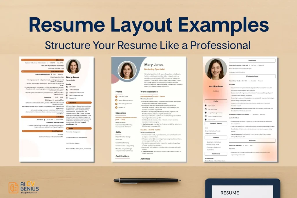
- Resume layout examples are not about looking pretty: They are about speed, clarity, and making your strongest proof easy to spot in a first scan.
- Four main layouts are compared with use cases: Reverse-chronological (Default and recruiter-friendly), functional (Skills-first for gaps or big pivots, but can raise skepticism), hybrid (Skills upfront plus timeline, often the safest “career shift” option), and creative (Only for truly creative industries and risky for ATS).
- Core layout rules stay consistent across formats: Keep 0.5 to 1 inch margins, readable fonts, consistent spacing, clean hierarchy, and enough white space to prevent fatigue.
- ATS compatibility is a recurring guardrail: Single-column structure is safest, and complex graphics, icons, and two-column designs can cause parsing errors that jumble information.
- A final checklist ties it together: Standard section headings, consistent formatting, appropriate length (Usually 1 page early to mid career), PDF testing, and a quick Notepad copy-paste check to catch layout and parsing problems.
Your resume layout serves as the visual architecture guiding a recruiter through your professional narrative. It dictates what information is prioritized, how easily your key strengths are perceived, and whether the overall impression is one of organized professionalism or confusing clutter. Even the most impressive experience can be rendered ineffective if presented within a poorly structured or difficult-to-navigate layout. Conversely, a strategic layout enhances clarity, emphasizes impact, and ensures your qualifications are immediately apparent.
In this guide, we’ll meticulously explore real resume layout examples – ranging from widely accepted traditional formats to more contemporary creative approaches. Crucially, we will demonstrate how to structure your information logically and effectively, ensuring every recruiter can swiftly navigate your career story, and every Applicant Tracking System (ATS) can accurately parse your essential data without error.
Why Resume Layout Matters: Beyond Aesthetics
A resume layout isn’t merely about visual appeal – it’s fundamentally about effective communication under significant time constraints. Recruiters often spend mere seconds on their initial scan; a clean, strategic layout ensures your most compelling achievements aren’t buried but instead capture attention immediately.
- ✅ Facilitates rapid scanning, allowing recruiters to quickly identify key qualifications.
- ✅ Ensures compatibility with Applicant Tracking Systems (ATS), preventing automated rejection due to parsing errors.
- ✅ Highlights critical skills and impactful experience sections naturally through clear visual hierarchy.
- ✅ Projects an image of organization, meticulous attention to detail, and professional confidence.
Think of your layout as the unspoken framework of your professional story: it doesn’t just present information – it strategically guides the reader’s perception and emphasizes your value proposition through structure and clarity.
Core Principles of an Effective Resume Layout
Regardless of the specific format chosen, adhere to these universal design principles for maximum impact and readability:
- Maintain consistent margins, typically between 0.5 and 1 inch on all sides, to create necessary white space and prevent a cluttered appearance.
- Use appropriate line spacing, generally 1.0 to 1.15 for body text within sections, with slightly more space between distinct sections to enhance separation.
- Employ formatting elements like bolding or capitalization strategically and consistently, primarily for section titles, job titles, and company names, to establish clear visual hierarchy.
- Stick to one or two professional, easily readable fonts maximum (refer to our detailed guide on Best Fonts for Resumes). Ensure font sizes are appropriate (10–12pt for body, 14–16pt for headers).
- Prioritize ample white space. A resume that feels breathable is significantly easier and faster to scan than a dense block of text, reducing recruiter fatigue.
Now let’s explore the four most prevalent and effective resume layout styles, detailing their structures, strengths, weaknesses, and ideal use cases.
1. Reverse-Chronological Layout (The Industry Standard)
This remains the most widely utilized and generally preferred format across most industries – and for compelling reasons. It lists your professional experience starting with the most recent position and working backward chronologically. This structure is ideal for professionals demonstrating steady career growth and consistent employment within a particular field.
Layout Emphasis:
Clear section titles (e.g., “Professional Experience,” “Education”), consistent date formatting along the left or right margin, and concise, achievement-focused bullet points under each role are crucial for scannability.
Structure Overview:
- Header (Name, Professional Title, Contact Info, LinkedIn URL)
- Professional Summary or Objective (Concise introduction tailored to the role)
- Work Experience (Most recent role first, detailing quantifiable achievements)
- Education (Degree, Institution, Graduation Date)
- Skills (Relevant technical and soft skills, often categorized)
- Optional Sections (e.g., Certifications, Projects, Volunteer Work – placed strategically)
Its straightforward, intuitive flow aligns perfectly with how most recruiters and hiring managers instinctively process career histories: “What is this candidate doing currently, and what relevant experience preceded this?”
| Pros | Cons |
|---|---|
| ✅ Highly familiar and universally preferred by recruiters and ATS systems. | ❌ Can inadvertently highlight significant employment gaps or frequent job changes if not addressed strategically (e.g., via summary or cover letter). |
| ✅ Exceptionally easy to follow career progression and assess recent experience quickly. | ❌ Less effective for individuals undergoing significant career changes where past job titles lack direct relevance to the new field. |
| ✅ Perfectly suited for showcasing steady advancement and increasing responsibility over time. | ❌ May appear somewhat repetitive if previous roles involved very similar core responsibilities without clear differentiation in impact. |
Best for: The vast majority of professionals with a relatively consistent work history applying for roles within their established field or industry. The default choice unless specific circumstances warrant an alternative format.
2. Functional Layout (Skills-Focused)
The functional layout deliberately shifts the primary focus away from chronological work history and instead emphasizes core skills and abilities, grouping relevant experiences and achievements thematically. This format can be strategically advantageous for career changers, freelancers with diverse project histories, individuals re-entering the workforce after a gap, or those whose most relevant qualifications stem from varied contexts rather than linear job progression.
Layout Emphasis:
Dedicate significant space to detailed “Skills” or “Areas of Expertise” sections. Use concise bullet points under each skill category providing specific examples or quantifiable evidence drawn from various past roles or projects. The Work History section should be minimal.
Structure Overview:
- Header (Name, Contact Info)
- Professional Summary or Objective (Clearly stating career goal and highlighting key skill areas)
- Key Skills & Accomplishments (Grouped into functional categories, e.g., “Project Management,” “Client Relationship Building,” “Data Analysis,” with supporting examples/metrics)
- Work History Summary (Often a very brief, concise list of employers and dates, sometimes without detailed bullet points)
- Education
- Optional Sections (e.g., Certifications, Relevant Projects)
This structure allows candidates to prominently showcase what they can do based on accumulated expertise, rather than solely relying on where and when they were formally employed. It effectively de-emphasizes potentially problematic employment gaps or non-linear career paths.
| Pros | Cons |
|---|---|
| ✅ Effectively highlights transferable skills and functional expertise, ideal for career transitions. | ❌ Often viewed with skepticism by recruiters as it can obscure chronological work history, potentially hiding gaps or lack of progression. Generally less preferred. |
| ✅ Excellent for freelancers, consultants, or individuals with diverse, project-based backgrounds showcasing varied capabilities. | ❌ Can be less compatible with Applicant Tracking Systems (ATS) which are typically optimized for chronological formats. May require careful formatting. |
| ✅ Strategically minimizes the visual impact of employment gaps or frequent job changes. | ❌ Requires exceptionally strong writing and compelling examples under each skill category to avoid sounding vague or lacking concrete proof. |
Best for: Significant career changers, individuals with substantial employment gaps, freelancers showcasing diverse project work, or those returning to the workforce. Use cautiously and ensure skill claims are well-substantiated.
3. Hybrid Layout (Combination Format)
The hybrid, or combination, layout strategically merges the strengths of both the reverse-chronological and functional formats. It typically begins with a robust “Skills Summary” or “Core Competencies” section near the top (similar to a functional resume), immediately followed by a concise reverse-chronological “Work Experience” section detailing roles and achievements. This structure offers an excellent balance, allowing candidates to prominently showcase key skills relevant to the target role while still providing the clear career timeline recruiters expect.
Layout Emphasis:
Allocate significant space to the initial Summary and Skills sections. Keep the Work Experience section focused, using fewer bullet points per role compared to a purely reverse-chronological format, emphasizing only the most impactful achievements. Maintain clear visual separation between sections.
Structure Overview:
- Header (Name, Contact Info)
- Professional Summary (Highlighting key expertise and career focus)
- Core Skills / Areas of Expertise (Detailed section with relevant technical and soft skills, often grouped)
- Work Experience (Reverse-chronological, concise bullet points focusing on achievements)
- Education & Certifications
- Optional Sections (e.g., Projects, Publications)
This format is increasingly popular and highly effective, particularly for mid-career professionals, technical experts, or individuals needing to highlight specific skill sets crucial for the target role without sacrificing chronological clarity.
| Pros | Cons |
|---|---|
| ✅ Effectively balances showcasing specific skills upfront with providing a clear chronological work history. Highly versatile. | ❌ Can sometimes become slightly longer than a strict one-page reverse-chronological resume if not carefully condensed. Requires discipline in content selection. |
| ✅ Generally well-received by both recruiters and ATS systems (if formatted cleanly). Offers the “best of both worlds.” | ❌ Requires careful design and formatting to avoid appearing cluttered or overly dense, particularly in the top skills section. Strategic use of white space is critical. |
| ✅ Excellent for highlighting specific technical proficiencies, transferable skills during minor career shifts, or key competencies required by the job description. | ❌ May slightly de-emphasize the narrative flow of career progression compared to a purely reverse-chronological format focused solely on experience. |
Best for: Mid-level professionals, individuals with specialized technical expertise (e.g., IT, engineering), consultants, project managers, and candidates making moderate career shifts where highlighting specific skills upfront is advantageous.
4. Creative Layout (Industry-Specific Use)
Creative resumes intentionally deviate from standard formats, employing unique visual elements such as distinctive typography, color palettes, icons, infographics, or unconventional layouts (e.g., timelines, multi-column designs) to express personality, showcase design skills, and make a memorable impression. These formats work best – and are sometimes expected – within explicitly creative industries like graphic design, web design, visual arts, advertising, branding, and certain marketing roles where visual presentation is integral to the job function itself.
Layout Emphasis:
Focuses on visual hierarchy, brand consistency, and showcasing design sensibilities directly through the document’s aesthetic itself. May utilize two-column structures, background images, or unique section dividers. Clarity and usability remain important, even amidst creativity.
Structure Overview: (Highly Variable)
- Header (Often incorporates unique typography or subtle branding)
- Brief Professional Bio or Summary (Focusing on creative philosophy or key strengths)
- Skills Section (May use visual elements like skill bars or icons – use cautiously for ATS)
- Experience / Project Portfolio Highlights (Often presented visually, emphasizing outcomes)
- Link to Online Portfolio (Essential)
- Education / Awards / Recognition
| Pros | Cons |
|---|---|
| ✅ Visually engaging, highly memorable, and effectively demonstrates design skills relevant to creative roles. | ❌ Extremely high risk of incompatibility with Applicant Tracking Systems (ATS). Often requires submission directly to a human or accompanied by a plain-text version. |
| ✅ Excellent tool for reinforcing personal branding and showcasing unique creative style. | ❌ Can easily appear unprofessional, cluttered, or difficult to read if over-designed or poorly executed. Functionality must not be sacrificed for flair. |
| ✅ Ideal for complementing online portfolios or personal websites, creating a cohesive brand presentation. | ❌ May distract from the substantive content (experience, skills) if visual elements are too dominant or overwhelming. Balance is key. |
Best for: Graphic designers, web designers, UX/UI designers, visual artists, illustrators, brand strategists, advertising creatives, and potentially some marketing roles within highly creative agencies or industries. Use with extreme caution outside these specific contexts, always prioritizing ATS compatibility if applying through online portals.
Essential Universal Resume Layout Tips
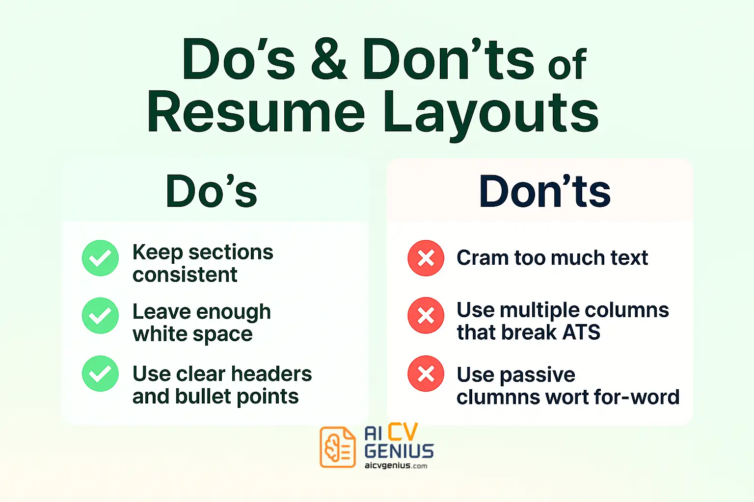
Regardless of the format chosen, adhere to these fundamental best practices:
- Start with a powerful, tailored summary or objective – your opening statement must immediately capture relevance and interest.
- Maintain consistent spacing between sections and bullet points to create visual rhythm and enhance scannability.
- Avoid unnecessary graphics, icons, photos (unless standard in your region/industry), or complex tables that can hinder ATS parsing and distract human readers.
- Always save and meticulously test your final resume in PDF format before submitting to ensure layout integrity and font rendering are preserved.
- Prioritize uncompromising readability and structural clarity above all other design considerations. Functionality trumps excessive flair.
Final Layout Checklist Before Sending Your Resume
Perform this quick visual and structural check:
- ✅ All essential sections are included and clearly labeled with standard headings (e.g., Summary, Work Experience, Skills, Education).
- ✅ Formatting (fonts, sizes, bolding, indentation, spacing) is strictly consistent throughout the entire document.
- ✅ Resume length adheres to standard guidelines (ideally 1 page for early/mid-career, max 2 pages for senior/executive unless academic CV).
- ✅ Spelling, grammar, dates, and alignment have been meticulously double-checked for absolute accuracy and professionalism.
- ✅ Font size for main body text is comfortably readable (typically 10–12 points). Section headers are distinct but not overly large.
- ✅ Layout is confirmed to be ATS-friendly (preferably single-column, avoiding tables/text boxes for critical info) by copy-pasting into Notepad or using an online checker tool.
FAQs: Choosing the Right Resume Layout
Final Thoughts: Structure as Strategy
An effective resume layout does significantly more than merely present your professional information – it strategically directs attention, implicitly builds credibility through organization, and creates an effortless cognitive flow for the reader. It functions as the silent yet powerful architectural layer ensuring your most compelling skills and achievements resonate clearly and immediately.
Choose a layout thoughtfully, aligning it purposefully with your specific career narrative and the expectations of your target industry. Remember, traditional doesn’t inherently equate to boring; creative doesn’t automatically signify chaos. The optimal layout is invariably the one that communicates unwavering clarity and projects authentic confidence most effectively.
For access to ready-to-use templates meticulously designed with professional layouts optimized for various career stages and industries, explore the curated collection within the Resume Templates Finder. Further refine your structural approach by consulting detailed customization advice in our Resume Templates Guides, or access broader expertise on resume content, keyword optimization, and interview strategies within our extensive Career Resources hub.
Effective design isn’t just about achieving visual appeal – it’s fundamentally about achieving strategic clarity. Ensure your layout doesn’t just get you noticed; ensure it gets you hired.